
Last week, Google hosted their annual developer conference, Google I/O 2019, at the Shoreline Amphitheatre in Mountain View, California. Alongside a range of office hours, codelabs and sandboxes held by Google employees from across many different departments, they also took to the stage to share advice and updates on several different topics.
Even though Google I/O is a conference geared towards developers, a lot of the content shared is incredibly valuable for SEOs and search marketers. For example, the key announcement from I/O 2019 that got the SEO industry talking was the news of evergreen Googlebot.
As Martin Splitt hinted at Chrome Dev Summit 2018, Googlebot has now been updated so that it uses the latest version of Chromium, rather than Chrome 41 which was launched back in 2015. This means that the new-and-improved Googlebot can now handle more advanced web features such as ES6. Take a look at the Google Webmaster Central announcement blog post to learn more.
The DeepCrawl team couldn’t resist the opportunity to learn more from Google experts, following the valuable technical SEO insights we gained from Google I/O 2018 last year. So we decided to listen in on some of the key sessions recommended by Google and a few others that caught our attention, and have collated all of the key points that will be most useful for SEOs.
The talks we covered include:
- The State of the Union Google Search
- Going Big: PWAs Come to Desktop and Chrome OS
- Building Successful Websites: Case Studies for Mature & Emerging Markets
- Google Search and JavaScript Sites
- Speed Tooling Demystified
- What’s New With Chrome and the Web
- Modern Web Testing & Automation with Puppeteer
The State of the Union Google Search – John Mueller & Martin Splitt
Talk Summary
John Mueller and Martin Splitt took to the stage to tell us about the latest Google Search features and how to take advantage of the new APIs and capabilities to help optimise your content (text, images, and video) to be discovered in search.
Key Takeaways
- Googlebot now uses the latest version of Chrome as its rendering engine and will be continuously updated with the latest version.
- Big changes are coming to image search with the addition of the high resolution image program, swipe up to navigate and 3D models in search.
- A new speed report is being introduced to Search Console and webmasters can sign up for access to the beta version.
Search is constantly evolving and adapting to meet user and publisher needs. As part of this evolution, Google search results are no longer pages with ten blue links, they now include features that highlight pages in different ways. The tools to help manage how pages are shown in search have also evolved too. While it is important to understand the new bells and whistles of Google’s search results, it is also important not to forget about the fundamentals of how Google finds and indexes web pages.
Content discovery
Googlebot is continuously crawling pages, which now total 130 trillion. You can get a new website known to Googlebot through links and by submitting them through Google Search Console. Once Googlebot has crawled one page, it will start crawling through all of the pages it finds linked from there. The internal links lead Googlebot to the rest of a website’s content.
You can help Google find content through backlinks, good internal linking and proper unique URLs. You can use robots.txt to exclude pages from being crawled and indexed. Googlebot can also discover pages via APIs, RSS feeds, Sitemaps, the indexing API for jobs and live streams and manual GSC submissions.
Updates to the rendering engine
Crawling is a simple GET request but modern sites are more than HTML, so there is an increasing need for Google crawl the rendered version of the pages it finds. Previously, Google used an old version of Chrome (version 41) to render pages but, for Google I/O, it was announced that its rendering engine is now evergreen. This is not a one time update, and means that Googlebot is continuously updated to render using the latest version of Chrome. 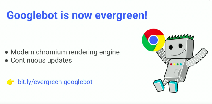 Googlebot’s evergreen update has been in testing for the last few months and is being monitored closely. Google decided not to update Googlebot’s user agent yet because they didn’t want to disrupt or break any websites, so they will let everyone know at a later date when that is planned for.
Mobile-first indexing
The rollout of mobile-first indexing started last year and now more than 50% of sites are being crawled and rendered primarily using Googlebot smartphone. The team is striving for mobile-first indexing to be rolled out to all sites and Martin is confident they will achieve this. Mobile-first indexing requires content, structured data, images, and metadata to be equivalent across desktop and mobile.
Martin recommends using responsive design, rather than separate mobile websites as there is only one live version of the site that needs to be maintained. You can learn more about mobile-first indexing in our comprehensive white paper on the topic. 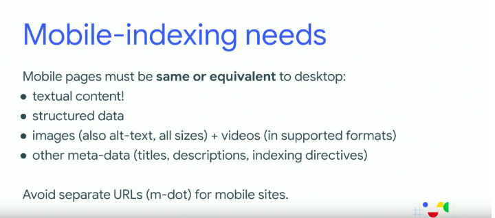
Updates to image search
Images are very valuable and useful across many types of websites and many different intents. Google has been working to improve image search, so that results have more context and provide more relevant and meaningful results. 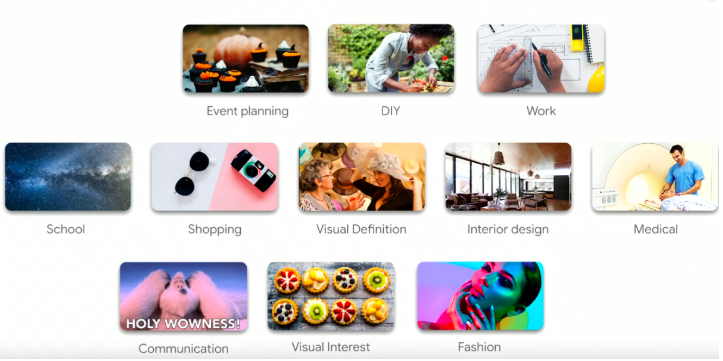 Previously searching for a query like “tire swings” would throw up all kinds of images which isn’t all that useful. Now Google Images provides a lot more context for image results, giving you a much better chance of navigating to relevant and meaningful websites.
 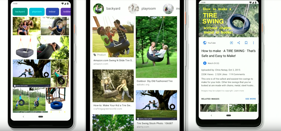 John recommends following these best practice guidelines for success in image search:
- Use high-quality images.
- Place images prominently near the top of the page, with text around them.
- Keep important image text alongside images, not embedded in the image.
- Make use of structured data like product and recipe markup. Use descriptive file names and a clean URL structure.
- Don’t use CSS styles, use img tags so Google can process images straight away.
- Use responsive images with the picture element and srcset attribute.
- Use lazy-loading with IntersectionObserver – which now works by default in the new version of Chrome.
As well as best practice recommendations, John had a few new updates that will be coming soon:
- High resolution image opt-in program – Through Search Console, websites with lots of high-quality images will be able to opt-in to a program that will allow these to be displayed across Google products, such as in the Discover feed.

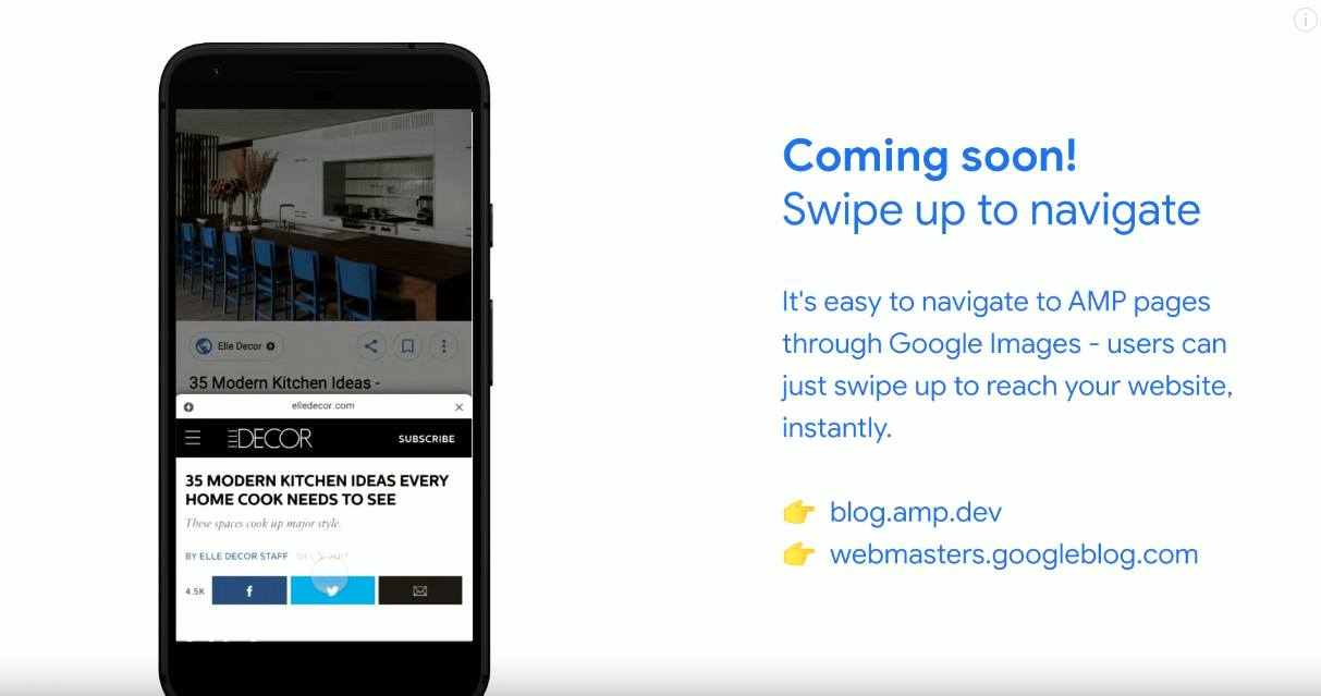
- Swipe up to navigate – Google will be displaying AMP pages in Image search and when you swipe up the page will be pre-fetched and rendered so that it displays instantly.
- 3D models in search – Google will be introducing the viewing of 3D models in augmented reality via search e.g. searching for “muscle flexion” will provide searchers with option to view a 3D model in AR, as pictured below.

Structured data markup
Structured data can help to provide context in a machine readable format. John recommends implementing structured data using JSON-LD, but microdata and RDFa are also supported. Implementing some types of structured data can help Google to show rich results in search. Here’s how you can go about implementing structured data:
- Select the rich result type you want to obtain for your website in search.
- Implement the markup, starting with a test page.
- Test your implementation using the Rich Results Test.
Implementing structured data increases the chances of achieving rich results but it doesn’t guarantee it. You need to ensure the markup is technically correct, compliant with Google’s guidelines and that the website is of a high quality. Some of the new types of structured data being introduced by Google include:
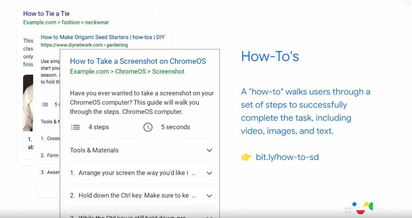
How-to markup for step by step tutorials to assist with real-world tasks.
Question and Answers markup provides support for people who have questions about a particular product or service.

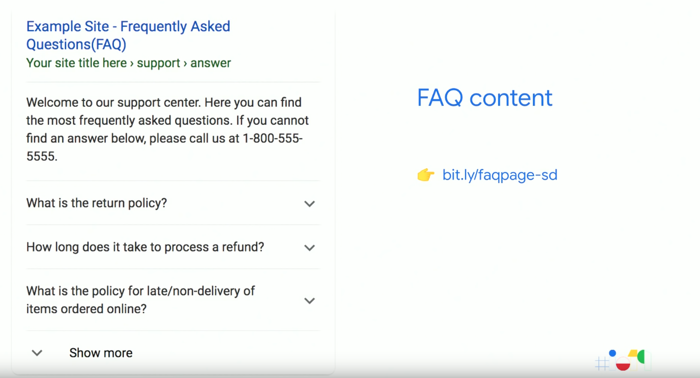
FAQ content markup is similar to Q&A markup but for pages that have multiple questions on them.
New Speed report in Search Console
Martin concluded the session by updating us on Search Console. All of the vital features of the old version have been moved over to the new version of Search Console (cough, cough). However, you can still access the features that haven’t (yet) been migrated to the new version by going back to the old version of the tool. New for Google I/O, Martin announced that Search Console will be launching a new speed report which you can get access to by signing up to become a tester here.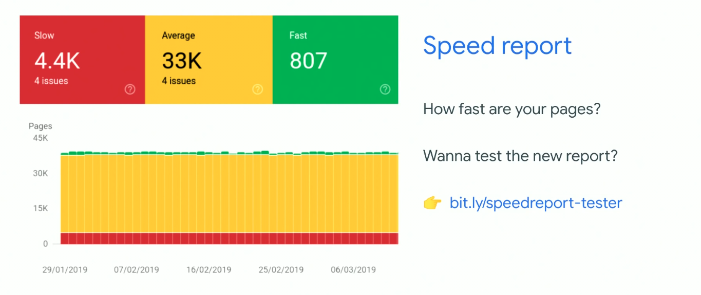
Going Big: PWAs Come to Desktop and Chrome OS – Dominick Ng & Paul Covell
Talk Summary
Progressive Web Apps (PWAs) aren’t just for mobile anymore, they make it possible to deliver high quality, capable apps on Windows, Mac, Linux, and Chrome OS. Paul Covell and Dominick Ng took us through the key things you need to know about how to build PWAs, some of the unique features they offer and the best practices you should be following.
Key Takeaways
- PWAs are websites with a few extra pieces. They bring app-like behaviour to websites and break them out of the browser, giving users the best of both worlds.
- All major browsers now support PWA installation, including iOS.
- As of August 2019, Chrome will include the PWA install prompt in its omnibox, which is their most prominent UI space.
Content across the web has largely been accessible by everyone, regardless of where they are or how they decide to access it. This isn’t true for applications, where they have to be built for each individual platform. Why should this universality only work for websites? Here are some of the differences between websites and apps: 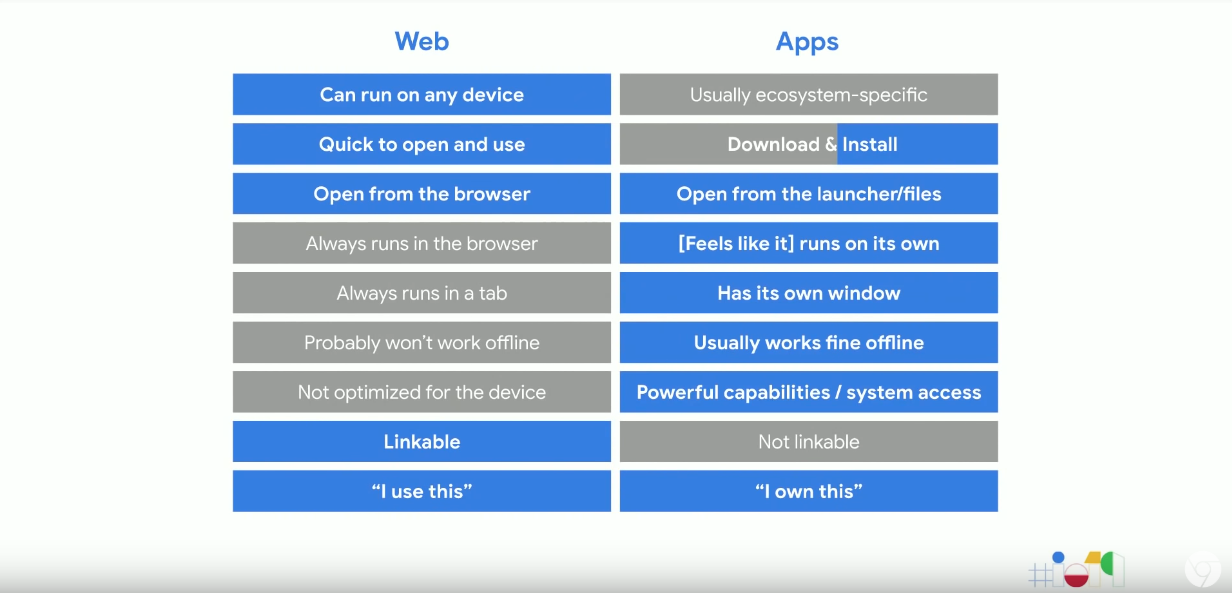 PWAs aim to bring app-like behaviour to websites and break them out of the browser so that users have the best of both worlds.
The birth of PWAs
In 2015 the mobile web was in a bad place. Apps were the users preferred medium on an increasingly preferred device due to their high-quality UIs, launcher icons and deep system integrations. PWAs then became the vehicle to level the playing field for the mobile web. Google encouraged developers to build touchable mobile-first responsive experiences to bridge the UI gap and by fixing system integrations so that PWAs worked seamlessly with Android.
Since then the core goal has been to use PWAs as a way of creating experiences which are indistinguishable from native apps. There are still areas for improvement but there have been big improvements in adoption rates, user engagement and developer success for PWAs. On top of this, all major browsers now support PWA installation, including iOS.
PWAs on desktop
Desktop remains the dominant creative platform. That’s why as of March 2019, Chrome now supports installing and running PWAs as standalone app experiences across all of its platforms. PWAs like Sketchup now work across all major browsers from one codebase. The web is no longer confined to the browser, it is now an open platform to make native experiences available. 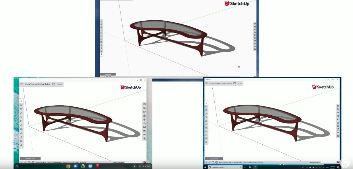
Key ingredients of PWAs
Simply put, PWAs are websites with a few additional pieces. 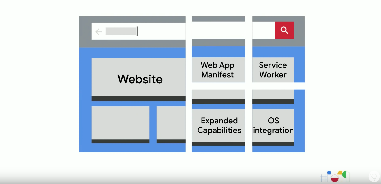 One of those pieces is the web app manifest. This is a JSON file linked to from a page’s header element providing application metadata which is used for a variety of purposes.
 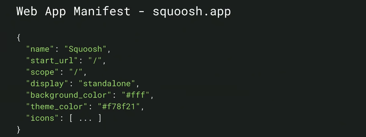 Looking more closely at the Web App Manifest, here are some of the main components:
- The name, icons, and start_URL are used to create the launcher shortcut for the app.
- The display member tells the browser how the app should be opened when it is run.
- The theme_color member sets the colour for the app title bar.
- The scope determines the extent of the app, including important link capturing behaviour.
As of 2018, all major mobile browsers respect the Web App Manifest for the Add to Homescreen functionality and this is true for many desktop browsers now as well.
Service worker
The service worker is a lightweight network proxy that allows offline functionality, by providing cached resources when network requests fail. This is how websites are able to break out of their online sandbox. We need to start architecting sites for “offline first” rather than “online first”. Google has repeatedly found that building from the ground up with offline in mind works better than retrofitting offline functionality. As with the web app manifest, all major browsers support the service worker API.
How to build an offline fallback page?
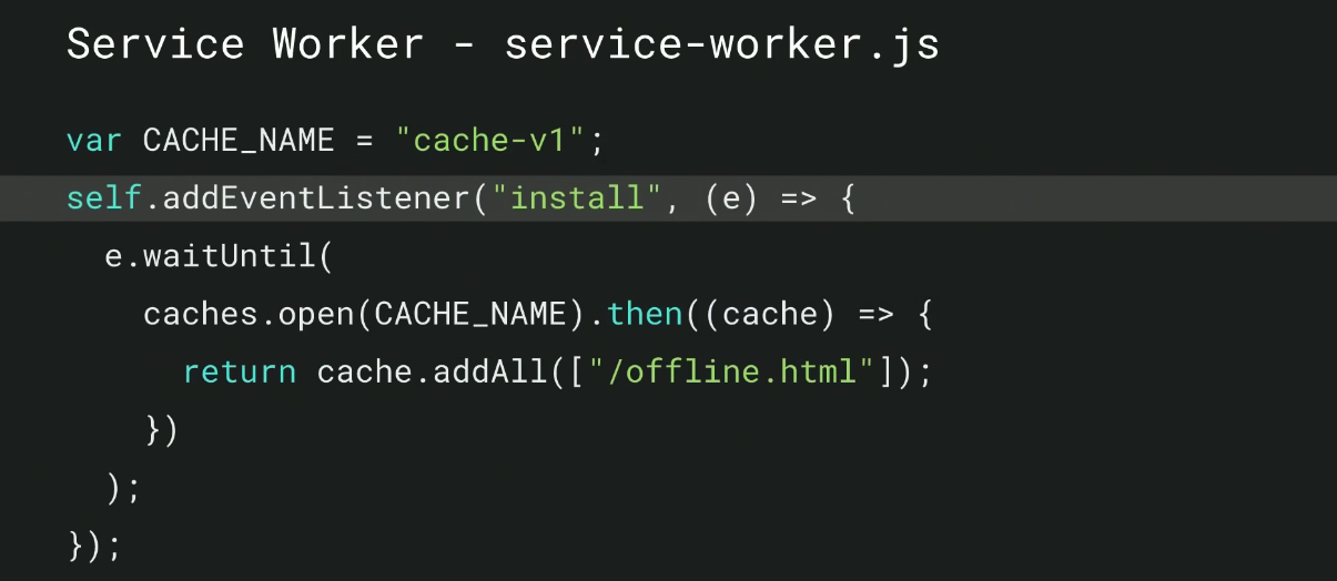
Dominick showed us how to build an offline fallback page in the event that there is no network connection. First, wait for the pageload event to register a service worker to make sure the pageload isn’t blocked. After registration is complete, the service worker file can run. You can also define a scope which determines the extent to which the service worker has control over the site. 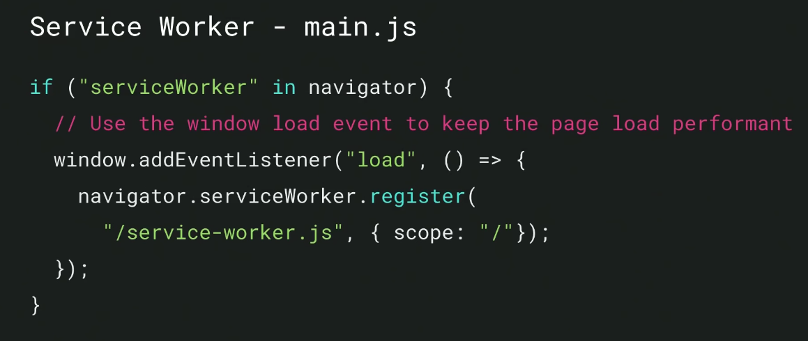 The service worker file waits for the install event to fire, which creates an offline cache using the cache API. The cache name is versioned, so it can easily be invalidated should it become out of date. Once a cache is open a list of the URLs can then be used for caching. The cache will then store those pages, ready for use later.
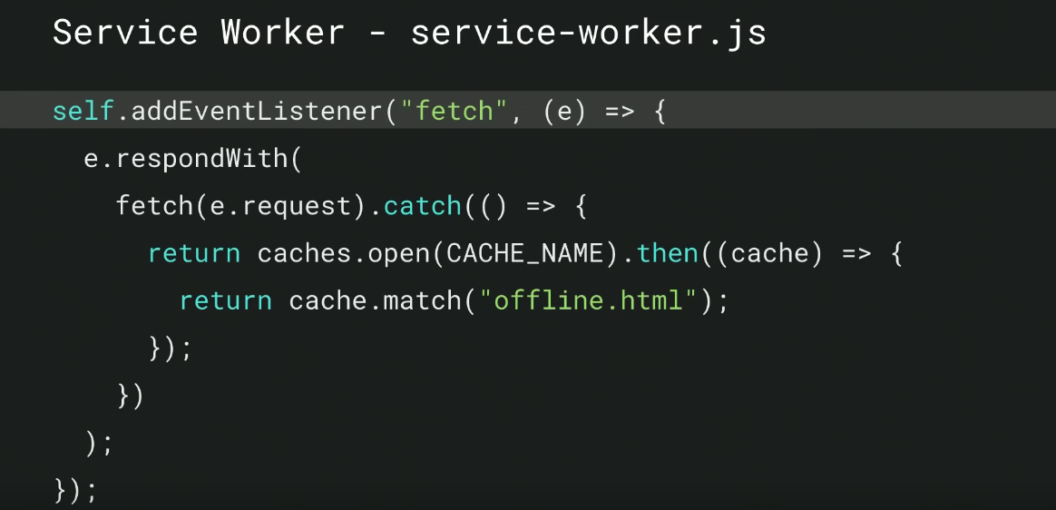
  Now that the page is cached, it needs to be retrieved and served when the network is down using a fetch event listener. This is fired with each network request and allows the service worker to intercept requests and substitute them when necessary. If a network request fails, the error will be caught, the cache opened and the correct page will be served from the cache.
PWA install prompt
Once you have a web app manifest and an offline experience powered by service workers, you can encourage users to add your PWA to their home screen with an install prompt, like the one pictured below. Adding an install prompt is important because it gives your PWA a permanent presence in the user’s launcher. As part of Chrome 76, to be launched in August 2019, Chrome will include the install prompt in the omnibox; their most prominent UI space.
Building Successful Websites: Case Studies for Mature & Emerging Markets – Aanchal Bahadur & Guests
Talk Summary
In this session, Aanchal Bahadur from Google’s Product Partnerships team talked about the necessity of making websites accessible for everyone everywhere, even for users browsing on low-end devices with slow connections, as well as the challenges that come with this.
To help us tackle this issue, Aanchal invited representatives from Twitter, The Times Group and Hulu to share their own experiences and processes behind building successful websites and web apps for their brands.
Key Takeaways
- The key to building a successful website is to ensure universal reach, reliability and a fast, seamless experience.
- You can do this by utilising the new superpowers available for the web, such as AMP and PWAs.
- Implementing a PWA can significantly enhance performance, engagement and UX, as demonstrated by brands including Twitter and Spotify.
Things are changing dramatically as the web continues to evolve. Technologies like AMP, Service Workers and PWAs have made the web more complicated. However, they can also contribute significantly to the goal of making the web work for everyone, everywhere. Each user is different; they are in different locations, have different devices, and browse on different connection types. However, to be successful in the long term you need to build for every one of them. This may sound challenging, but every user shares a common need: a fast, seamless experience.
As a user, I don’t care which tech stack these companies use to give me what I want, I just want a good experience.” -Aanchal Bahadur
Aanchal described technologies like PWAs and Service Workers as the ‘superpowers’ of the web, and explained that we can harness these powers to provide our users with better experiences. To explain how this can work in action, she invited some special guests from Twitter, The Times Group and Hulu to share their own experiences of creating PWAs, the processes they implemented and the results they saw.
A Case Study from Twitter
Jesar Shah and Charlie Croom from Twitter took to the stage to talk about how Twitter’s PWA was built, and how this helped them implement new capabilities across desktop and mobile, all while using one codebase. The aim of building a PWA was to allow for instant experiences, no matter what device is being used.
<lt;h5>The Process:
- One single codebase is used when creating a PWA, so you build once and ship to everyone. This allows for better updates and consistency across platforms.
- A mobile-first strategy was implemented which tackled the main challenges of poor connectivity, slow mobile networks, expensive data plans and low storage on devices. The solution? Twitter Lite, which was the first iteration of their PWA.
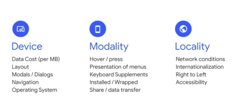
- It helps to start segmenting potential issues by device, modality and locality for improved UX across all of them. For example, what is the output of an app on a 2G connection? What if the device is low on memory?
- The PWA was listed in the Play Store on Android which increased discoverability.
- Reviews and ratings from being listed in the Play Store also helped Twitter identify gaps in UX and highlight opportunities for improvement for the PWA.
- Twitter utilises Trusted Web Activities as a building block on Android.
- Component-based design is also used which improves the consistency and ease of code implementation. Twitter uses React, but you can use any component-based framework to do this.
The Results:
- The PWA has allowed Twitter to work on almost every browser and almost every operating system.
- Moving to one codebase lowered development costs and created engineering velocity.
- 3x increase in tweets sent since the PWA launched.
- The install size has significantly decreased.
Jesar & Charlie’s Advice:
- Tackle the core experience first and make sure that the code everyone sees is the very best that you can write.
- Identify your users and, more importantly, the devices they are using and the properties that those possess.
- Use progressive enhancement to create an experience that adapts to the different properties of the devices and the needs of each user.
A Case Study from The Times Group
Rudra Kasturi from The Times Group also presented a case study on how Navbharat Times (NBT), an Indian newspaper with over 65 million readers, improved its online experience by building a PWA. The majority of users in India are on slow connections on low-end devices with low storage capacity, so the aim was to create something fast, light and reliable. 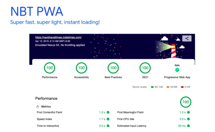
The Process:
- A performance budget was implemented, a JavaScript limit was set for each page, and the aim was to make sure that Time to Interactive always stays under 5s.
- An automatic alert system has been set up to trigger when this limit is exceeded so issues can be quickly identified and fixed.
- JavaScript usage per-page was decreased through code splitting, resource optimisation and offline caching.
- Webpack bundle analyzer was used to help reduce JavaScript file size by 70%.
- As a media site, NBT relies heavily on images, so the team used IntersectionObserver API to prioritise and lazy-load images.
- Workbox was used to implement caching strategies so users are still able to consume the top 20 NBT stories when they’re offline.
- NBT wanted to earn the love of their users, so they used the ‘add to homescreen’ to prompt installs when users were most engaged, allowing them to explore the capabilities of the PWA first before being bombarded with prompts.
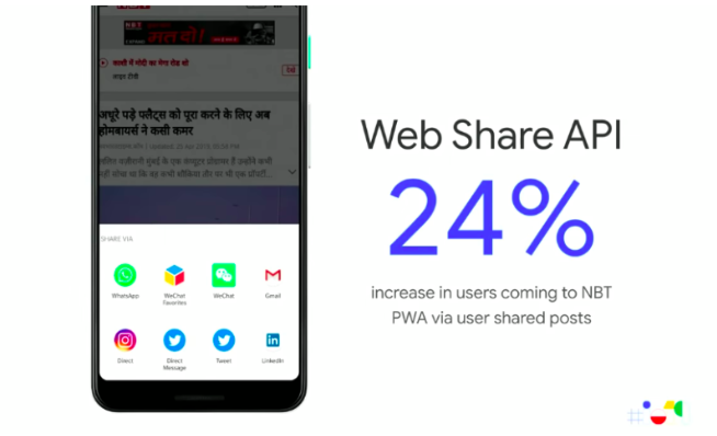
- The Web Share API was used which triggers in Android. This makes sharing content easier and also gives users more control over how they can share articles.
The Results:
- Users coming to PWA via shared posts has increased by 24%.
- Engagement has increased by over 50%.
- 72% growth in acquiring new users.
- 31% increase in average session duration.
A Case Study from Hulu
To wrap things up, Matt Doyle told the story of how Hulu built a desktop PWA to create a better experience for their users, and the benefits that were seen after the launch. The team’s mission was to make sure that each experience was tailored to every user’s device; from the TV in their living room, to the laptop on their desk, to the phone in their pocket.
The process:
- User feedback was utilised. When users were asked why they were using a legacy desktop app even after a new website had been launched, the response was that they liked that it was installable and that they didn’t have to go through different browser tabs to get to what they wanted; their TV shows and movies were a click or a tap away. This showed a fantastic opportunity for building a PWA.
- To build the first iteration of the PWA, Hulu started small with just a Web App Manifest and a Service Worker.
- Caching was implemented to make sure the data in Hulu was fresh for users at all times.
- To research, build, QA and launch a baseline PWA, it took just one developer and one sprint (two weeks).
- Coming soon: support for push notifications, MediaKeys and Media Session API, and an enhanced offline experience.
The Results:
- 27% increase in return visits.
- More importantly, users have been providing feedback saying that they love the PWA, which is more meaningful than any KPI.
Matt’s Advice:
Listen to what your users are saying. They can have really good feedback for you when you’re making development choices.
Other brands that have seen big wins by adopting PWAs
- Spotify: By using a PWA, engagement has significantly increased.
- Tokopedia: By using a combination of AMP and PWA, conversions are now 5x higher.
- Terra: By implementing the Web Share API for their PWA, users are sharing more articles.
- Bücher.de: By using a PWA and Trusted Web Activities on Android, the experience on Play Store has improved and visibility has increased.
To learn more about building successful websites and web apps that perform and engage users, Aanchal recommends checking out the resources on web.dev.
Google Search and Java Script Sites – Martin Splitt & Zoe Clifford
Talk summary
In this session, Webmaster Trends Developer Advocate Martin Splitt and Web Rendering Engineer Zoe Clifford explained how Googlebot crawls and renders websites to ensure content can be found through Google search, whilst providing good user experiences. They also announced an exciting update to the Googlebot Web Rendering Service.
Key Takeaways
- Google is continuously working to improve their systems to ensure JavaScript can work for SEO.
- The new evergreen Googlebot, running with modern Chromium, will continue to be updated and improved.
Why Understanding JavaScript and SEO is Important
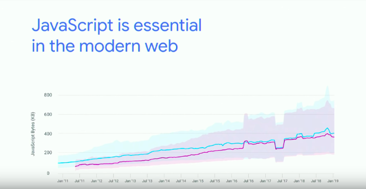
The amount of JavaScript being used on the web has been growing steadily over the last few years and is now more prominent on websites than ever before. Martin feels the sentiment from SEOs is that JavaScript is the worst thing ever, and explained that as a tool it can be used to make great websites. As an integral part of the web, JavaScript enables many new capabilities but if you use it incorrectly, or overuse it, problems can arise.
The New Evergreen Googlebot
Previously, Google had been using the engine from Chrome 41 to render pages. However, on Tuesday they announced that Googlebot now runs the latest Chromium rendering engine, currently Chrome 74, when rendering pages for search and this is already being used to crawl sites. Not only does this mean Google is now using the latest stable Chrome engine to crawl and render websites, but moving forward they will also ensure the rendering engine is updated regularly.
What does the rendering update mean for SEOs?
With this latest update to the WRS, modern JavaScript is no longer a blocker for SEO, allowing sites to make the most of JavaScript features, without the need for as many polyfills as before. In fact, compared to the previous version, Googlebot is now able to support over 1,000 new features. Testing tools including Google Search Console and Google’s Mobile-Friendly Test will also be updated soon to reflect this, with the importance still being placed on user experience.
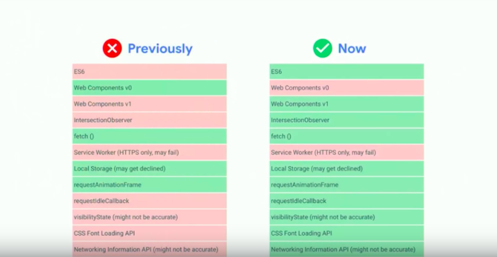
It is important to remember that despite this update, the render queue will still be in place due to Google crawling, indexing and rendering pages separately. While is delay still exists, it is important for websites to have a fallback, to ensure both Googlebot and users are still served useful content.
In this case, Server Side Rendering can be used to improve both the user experience and SEO of a site, with SSR and Hydration also being recommended, particularly for Web Apps, due to its ability to provide a dynamic nature even if the initial content is in HTML. Pre-rendering should also be considered, in particular for sites where the content doesn’t change often, for example landing pages and blogs.
To find out more about JavaScript and SEO, Martin recommends watching the JavaScript SEO playlist on the Google Webmasters YouTube channel.
Our Ultimate Guide to JavaScript for SEO Whitepaper also covers more around understanding and optimizing JavaScript for search, with insights from industry-leading experts across the SEO and engineering communities.
Speed Tooling Demystified – Performance Made Easy – Paul Irish and Elizabeth Sweeny
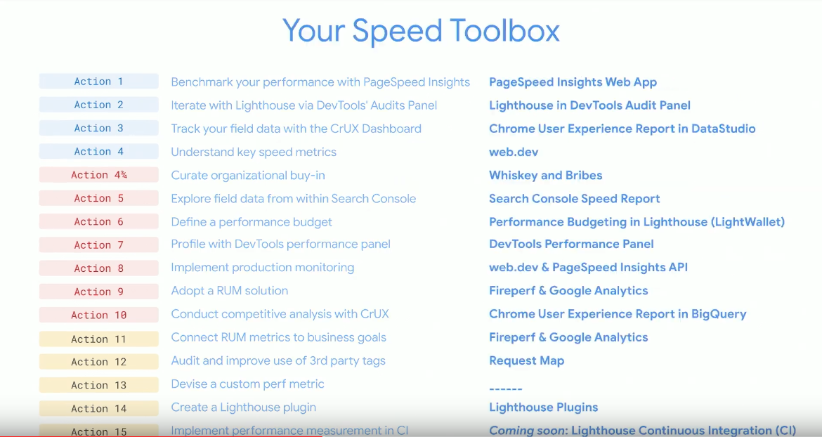
Paul Irish and Elizabeth Sweeny from the Google Chrome Web Platform showcased a blueprint they have created to effectively assess and optimise site performance. These 15 steps include; how to identify site speed issues, benchmarking against lab and field metrics, implementing performance recommendations and monitoring these improvements using Google tools. This session also announced some exciting new developments to Google Search Console and Google Lighthouse.
Key Takeaways
- The importance of site speed to users is increasing.
- Improvements to site speed not only provide a positive user experience, they also have a direct impact on business success.
- Once you have identified site speed issues, it’s important to benchmark these against lab and field metrics, as well as your competitors’ sites.
- When implementing performance improvements, monitoring their impact through tools including Lighthouse, PageSpeed Insights and Search Console enables you to collect valuable data to prove the success and business value of fixes.
- New Lighthouse plugins will allow you to track and measure KPIs that are specific to your site.
- Updates to Lighthouse include a new UI, Lighthouse Stackpack, Lighthouse Wallets and Lighthouse Plugins.
The Importance of Site Speed
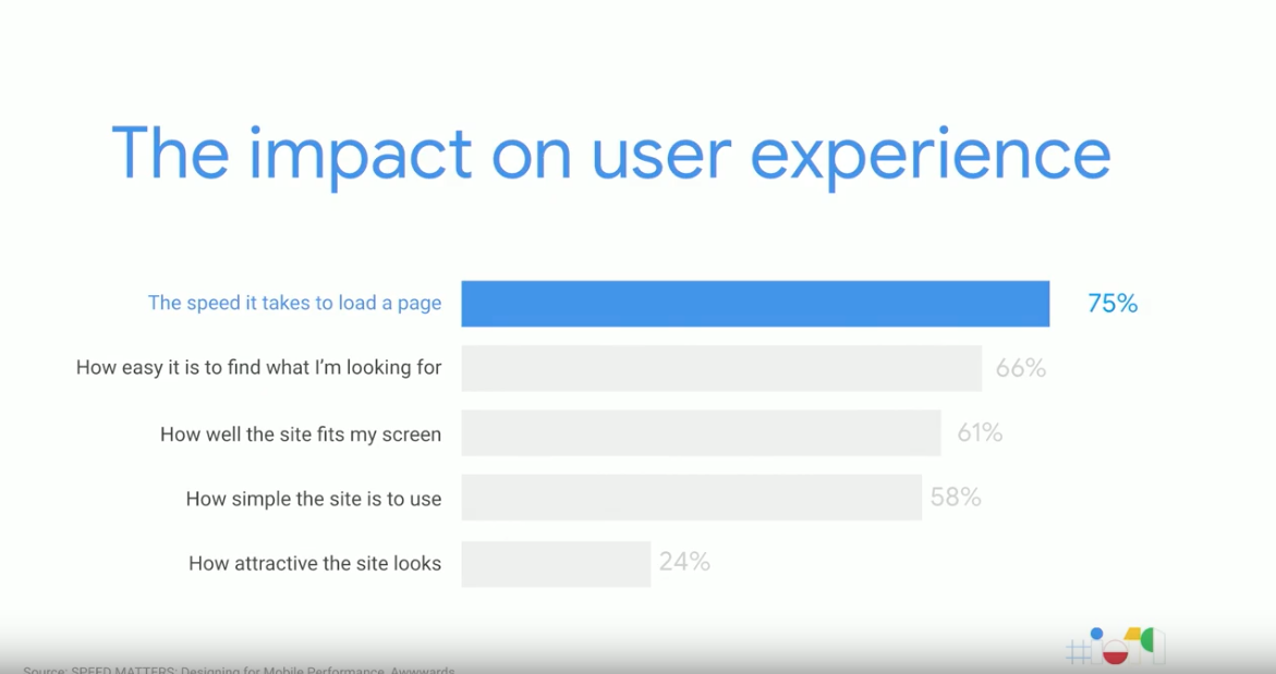
The impact of a slow website on user experience is not minimal, in fact, the time it takes for a page to load is the most important factor in a user’s mobile experience and is three times more important than what the site looks like.
Tangible ROI
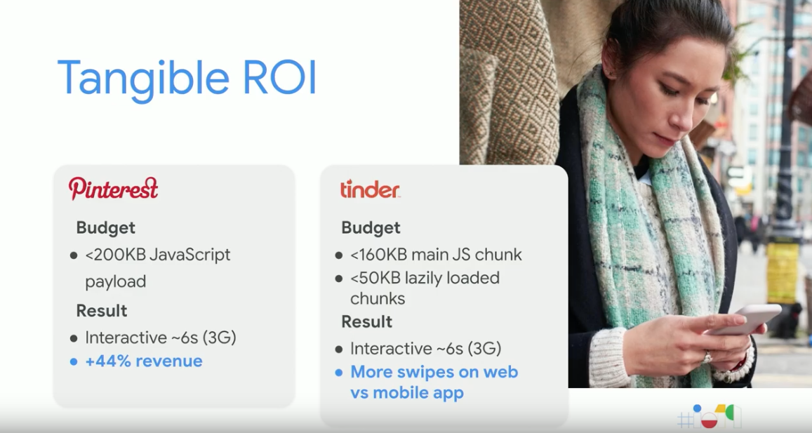
It isn’t just about increasing speed and performance for the sake of it, improvements to site speed have a direct impact on business success, with both Pinterest and Tinder seeing uplifts in user sentiment and engagement after implementing an aggressive performance budget. From this, it’s clear that a strong focus on designing fast sites provides more satisfaction to users, which results in a higher conversion rate and more time spent viewing pages.
Where to Start With Performance Optimisation
With many factors to consider when optimising a site for performance, having a clear structure to follow is important for success. This is why the team at Google have designed a Performance Blueprint containing 15 recommended actions starting from the basics and scaling up to create a mature web performance culture.
Blueprint Foundations
Containing 4 and ¾ actions, this first section of the blueprint is about setting up the fundamentals for performance.
Action 1: Gain a high-level overview of page speed
The first action entails gaining an understanding of the current status of the site, using the PageSpeed Insights (PSI) Web App. Combining field data from The Chrome User Experience Report and lab data from Lighthouse, this report will provide a score calculated with weighted performance metrics.
Action 2: Make the changes and measure the impact
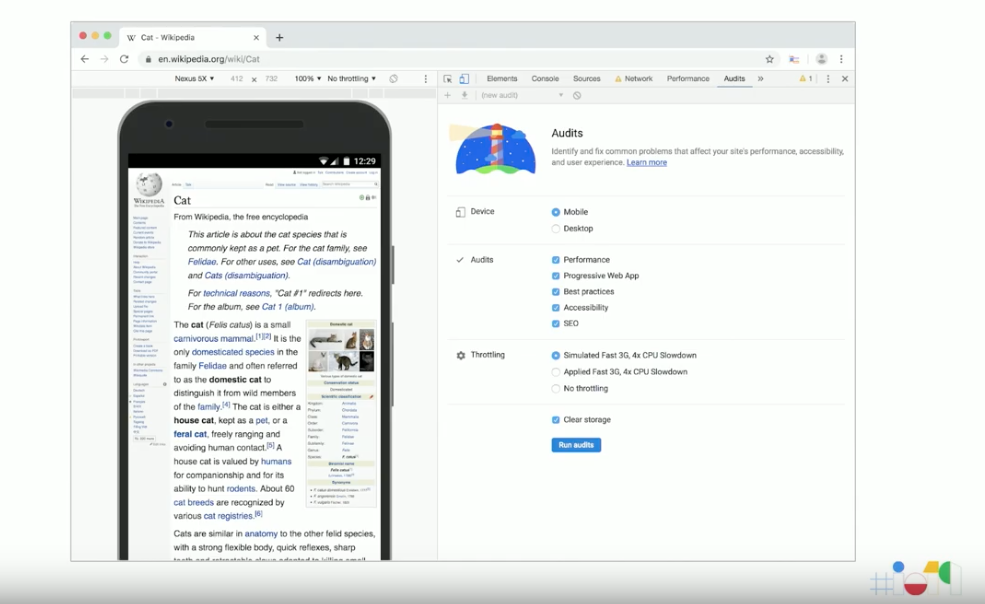
This involves implementing the recommendations provided by the PSI reports on the local environment and testing these through Lighthouse via the DevTools Audits panel in Chrome.
Changes to Lighthouse
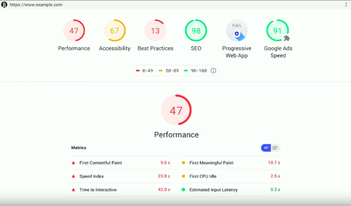
A brand new version of Lighthouse, version 5.0, has been released which sees updates to the overall UI of the tool, designed to ensure the reports produced are clear and actionable. This new interface will also be in the PageSpeed Insights and Chrome Canary and they’ve even added a Dark Mode option.
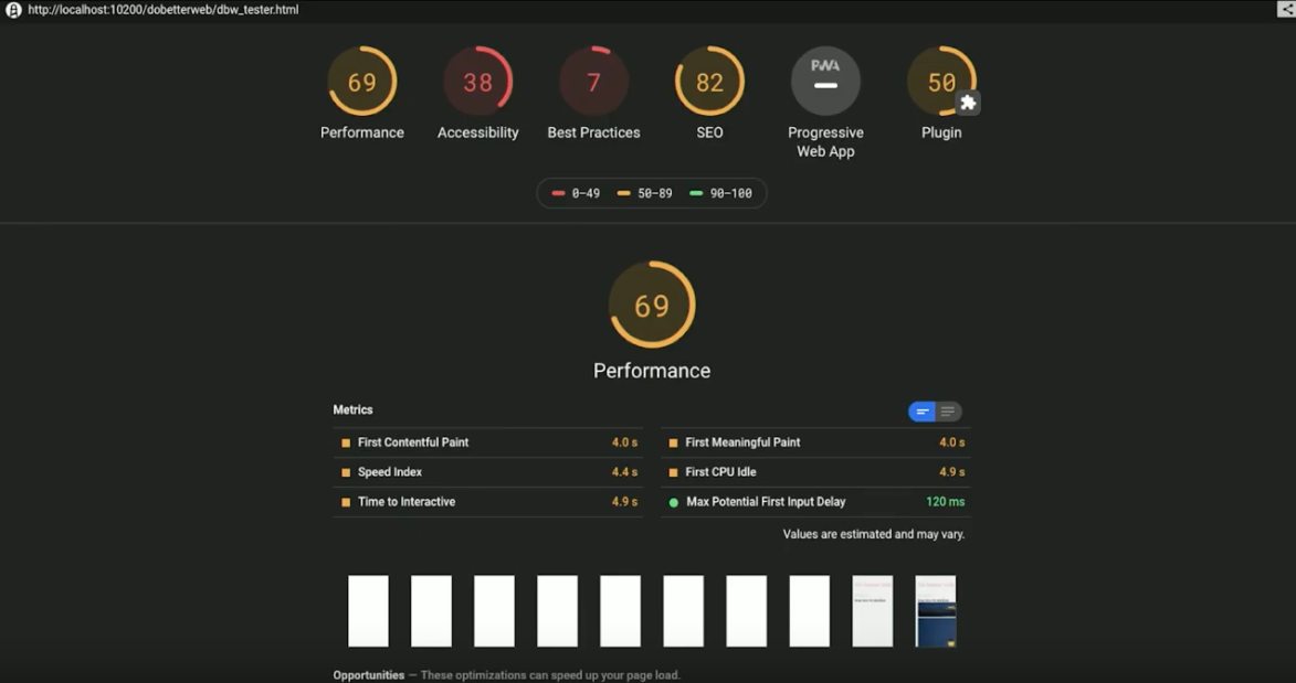
Lighthouse Stack Packs
The update also introduces Lighthouse Stack Packs, which will provide specific recommendations based on the tech stack you are using. The first Stack Pack is available now for WordPress, with further platforms coming soon.
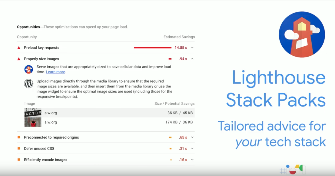
Action 3: Track field metrics over time
Using the Chrome User Experience Report Dashboard (built via DataStudio) you will be able to understand how a site’s performance has evolved over time. There is also the ability to drill down and view specific field metrics, as well as stats including the proportion of device usage and network connection types.
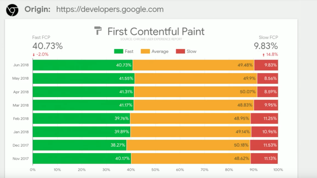
Action 4: Quantify Users’ Experience
In order to accurately measure user experience, it’s important to understand the key speed metrics used to measure load time, as well as user-centric performance metrics. We cover these metrics in more detail, with examples and best practice recommendations, within our Ultimate Guide to Site Speed and Performance White Paper.
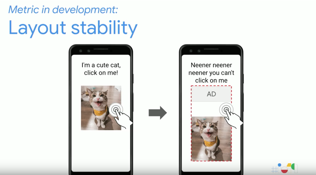
New Metrics In Development
With performance becoming an increasingly important factor for success, there are several new metrics in development, these include;
- Layout Stability – this is used to quantify the experience seen when elements shift around on a site whilst loading by collecting data such as their dimensions and movements.
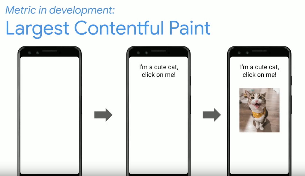
- Largest Contentful Paint – this metric is focusing on the moment when the largest piece of content (this could be text, an image or a video) finishes loading.
Action 4 ¾: Ensuring you have support from all stakeholders of the organisation
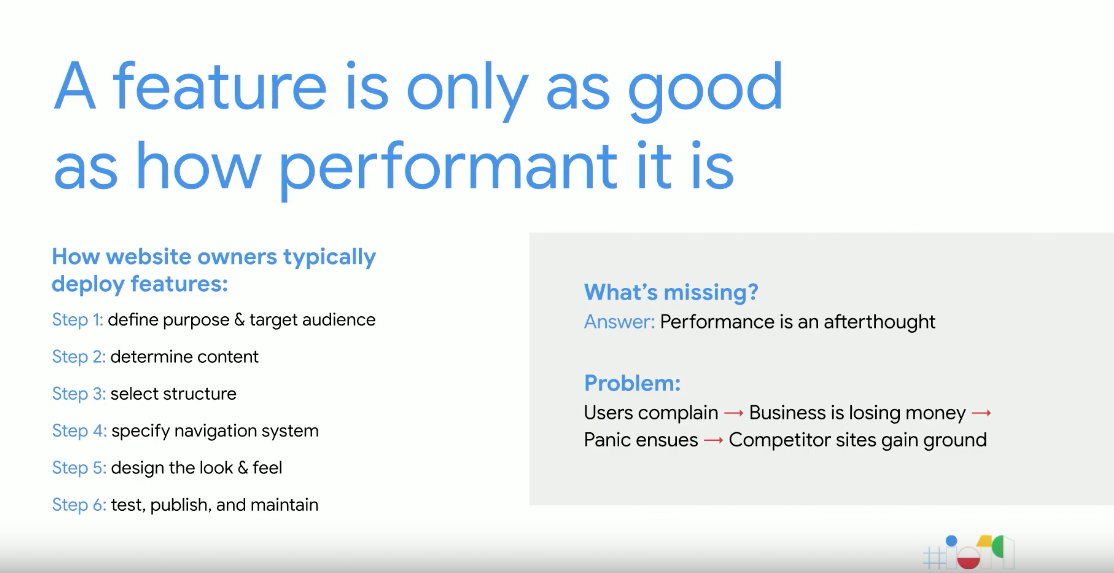
As performance is often seen as an afterthought in development, it’s important to ensure everyone involved understands how site speed impacts the business.
Blueprint Plumbing
Featuring another 6 action points, this section of the blueprint is focused on professional performance techniques.
Action 5: Explore field data within Google Search Console
Just getting users to your site isn’t enough, ensuring they have a positive experience on a fast performing website has become a necessity.
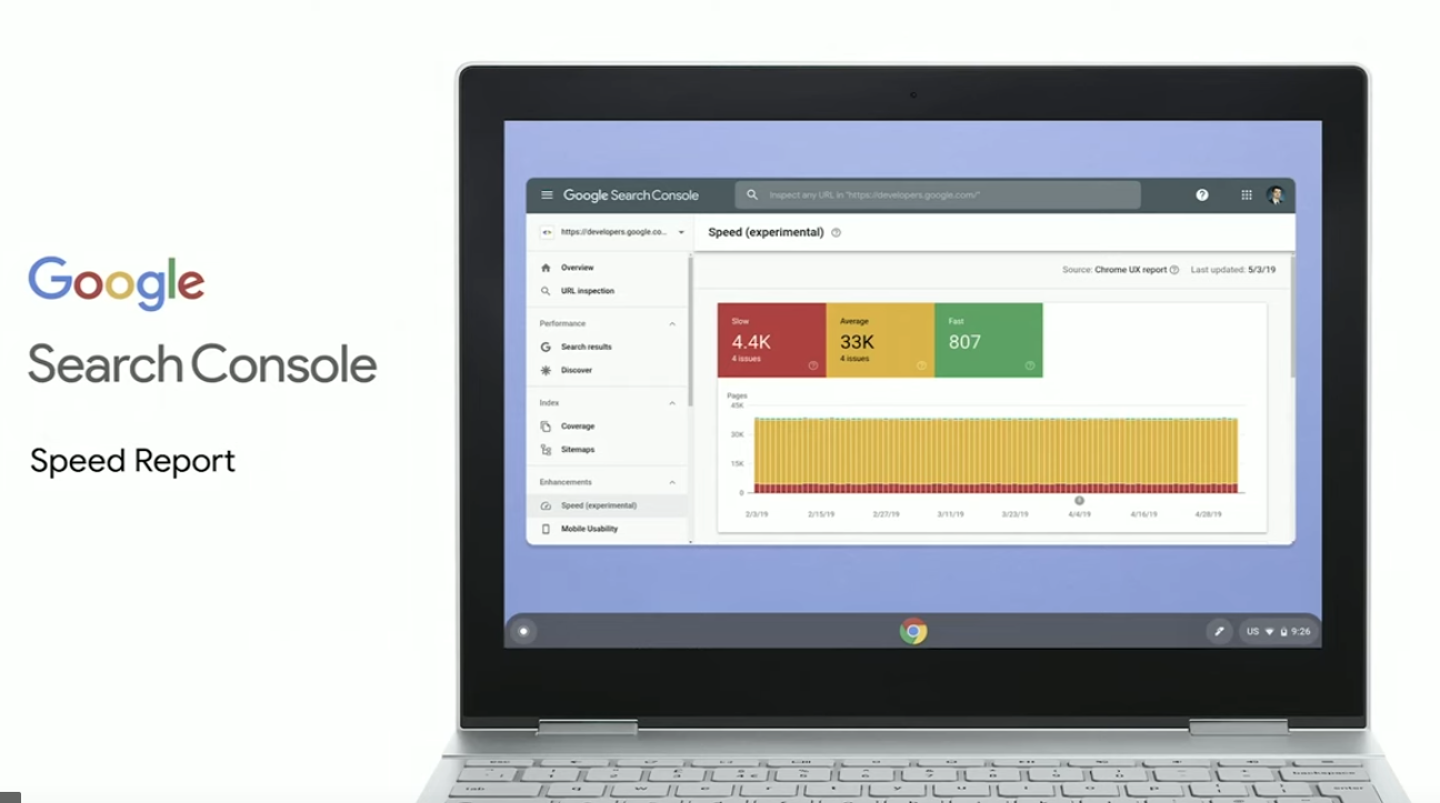
New Search Console Speed Report
Currently in Beta, the new Speed Report available in Search Console will feature field metrics based on the Chrome User Experience Report data. From this report, you will be able to see an aggregated view of your site’s key speed metrics, with the added ability to drill down into specific issues. From here you will be able to find examples of pages needing improvements, implement the fixes and then monitoring these through the Chrome Developer Tools.
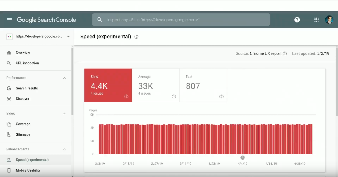
The summary features a trend graph displaying performance over the period you have selected, enabling you to see the impact of any fixes made.
The metrics will be classified into three buckets;
- Slow – pages will be classed as slow if they are considered slow for any metric, either on desktop or mobile.
- Fast – if pages are considered fast for all metrics, across all devices they will fall into the fast category.
- Average – all other pages will be classed as average.
Page Grouping
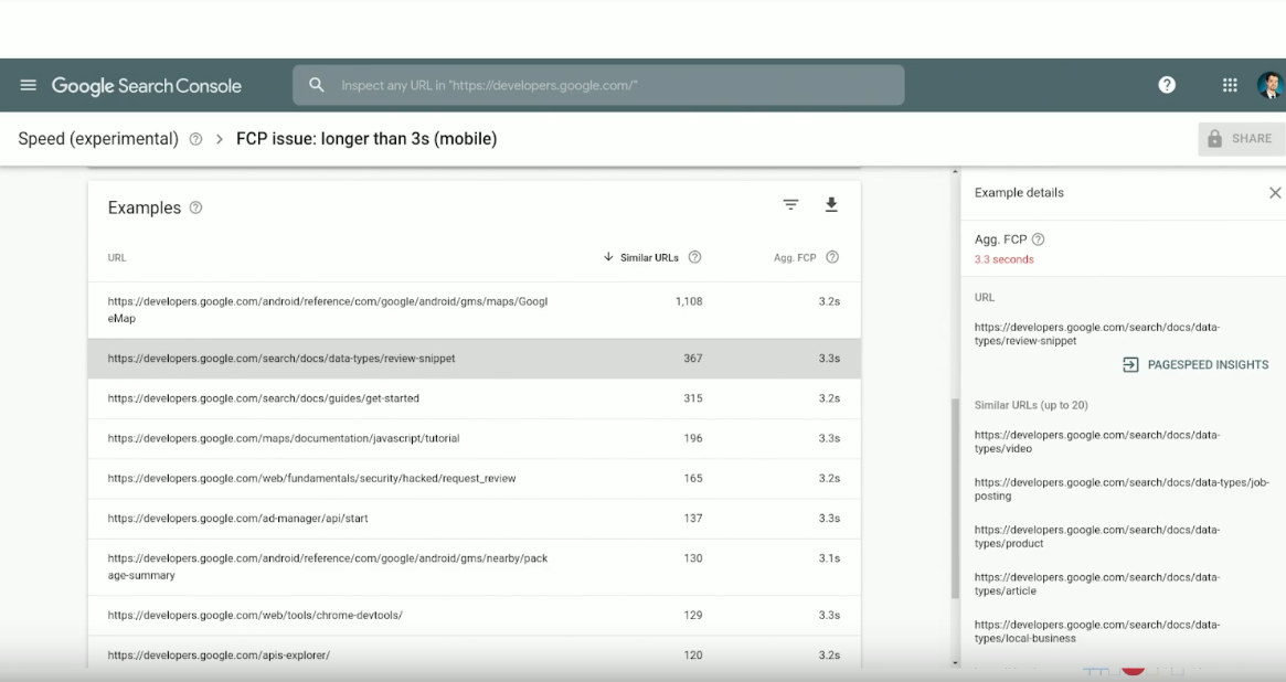
As it is unrealistic to fix an entire website in one go, Page Grouping will help site owners figure out where they are best placed to focus their resources when planning speed fixes. This takes all the pages on the site and groups them together with pages that have a similar experience, with the same underlying technical issues. This allows you to focus on implementing the actionable recommendations on the pages you care about the most.
Action 6: Set goals and define a success/performance budget
After deciding what you want to measure, the metrics you want to be tracking and the tools that will be used to do so, the next step is to define a performance budget that feels achievable for your team.
Lighthouse Wallet
The new Lighthouse Wallet allows you to incorporate the performance budget into your workflow. This will enable the whole team to evaluate how well the site is performing against the goals which have been set.
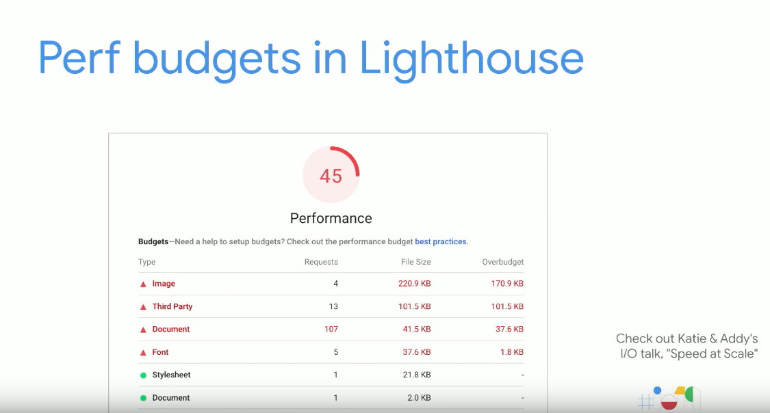
Action 7: Diagnose specific aspects of what is affecting page load
The DevTools Performance Panel available in Chrome allows you to dig into the details of page performance and find opportunities for improvement.
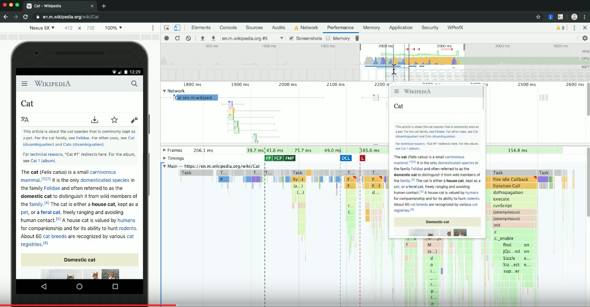
Action 8: Automate as much as possible
Once performance enhancements are beginning to be implemented, it’s important to track the improvements seen from these, as well as look out for any regressions on the live site. Using the web.dev measure tools you will be able to adopt product monitoring and run audits to track performance over time.
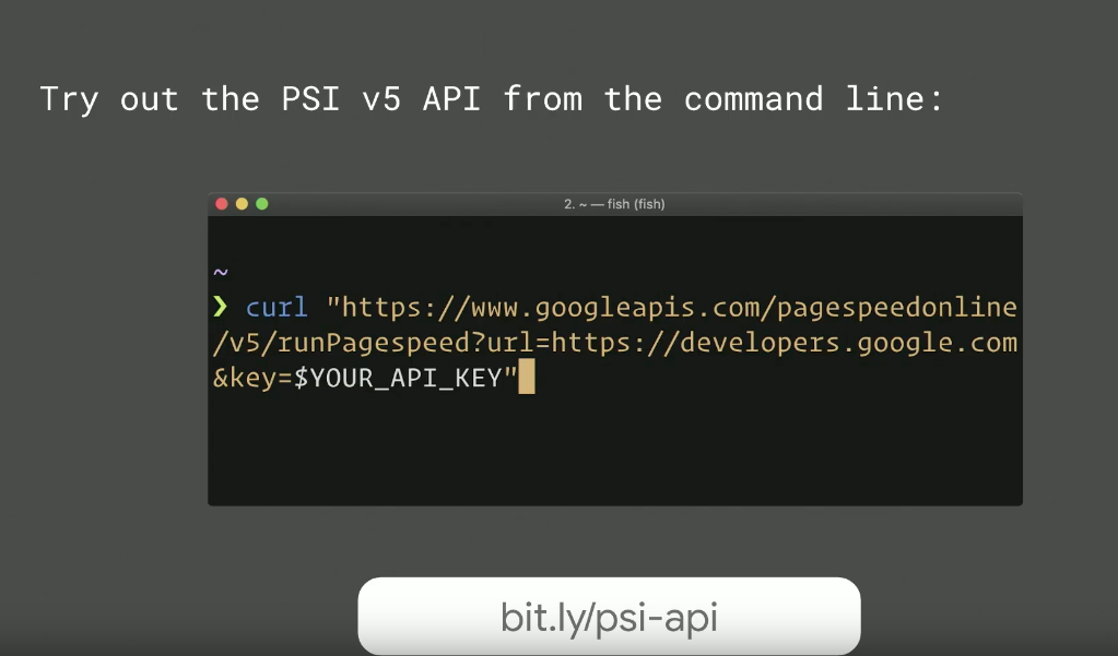
Action 9: Dive deeper into user behaviour on the site
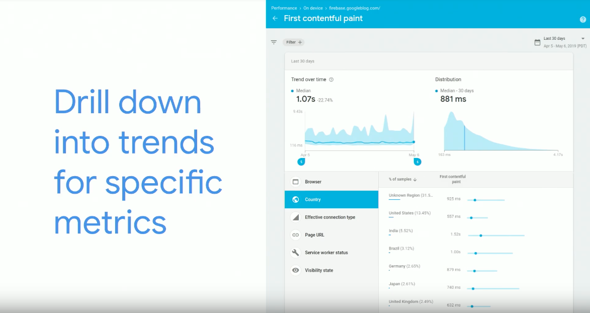
The newly launched Firebase Web Performance Monitoring solution provides aggregated real user measurements for individual web pages. This will enable you to monitor a website’s performance after improvements have been implemented, with the ability to drill down to view specific metrics.
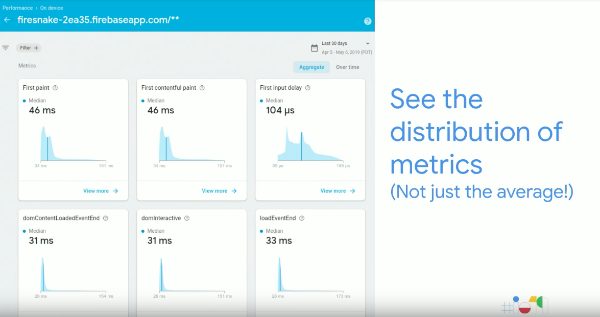
Action 10: Compare and monitor performance against others in your industry
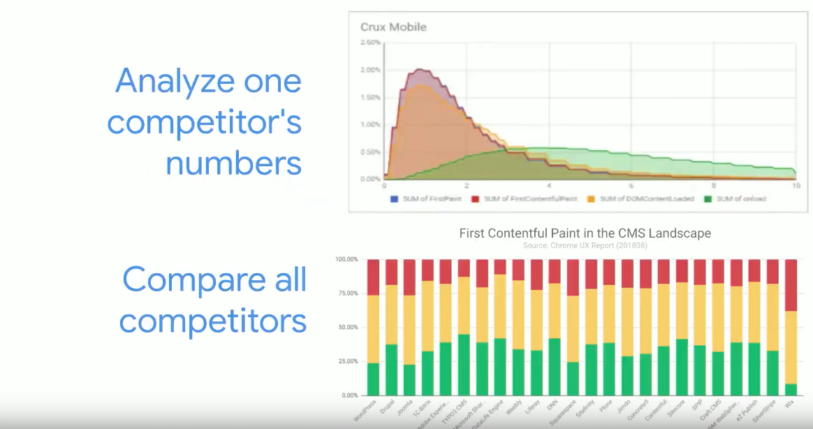
As well as monitoring the ongoing performance of your site following the implementation of the fixes, conducting competitor analysis is also important. This can be achieved with the CrUX report using BigQuery, which will also allow you to compare all competitors within an industry.
Blueprint Electrical
The final section of the blueprint is designed for robust regression defence and concludes with the final 5 actions.
Action 11: Measure the correlation between performance and revenue
This step is considered one of the most valuable things you can do and involves connecting real user monitoring metrics to business goals. This will enable you to collect ROI data and prove the business value of the improvements which have been implemented.

Action 12: Mitigate the performance impact of third-party tags
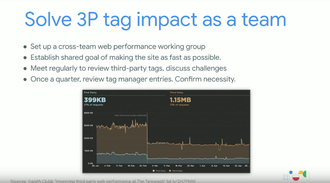
This step involves auditing the use and performance impact of third-party tags, some of which can cause significant bloating to a site.
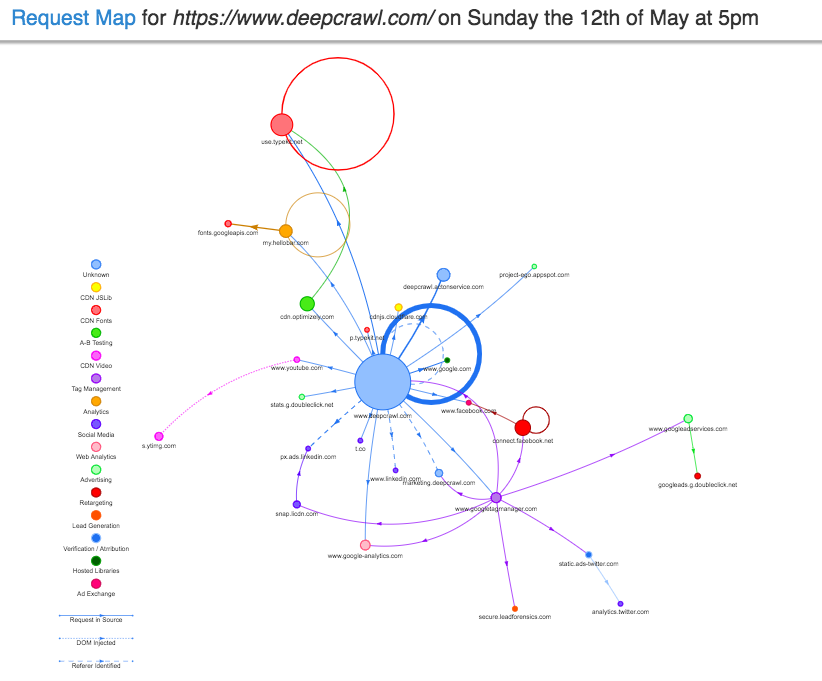
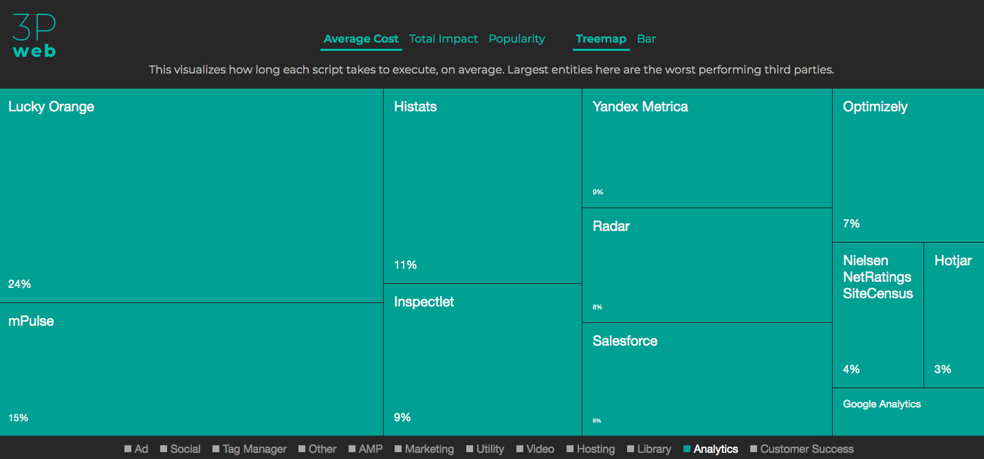
There are a number of tools which allow you to see a view of the third party tag situation on your site, including Request Map. This provides a visual request map of tags used on a site, along with CSV data detailing the total number of requests and load time for each third party tag on your site.
Another tool is Third Party Web, which summarises the run-time cost of different third-party tags across the web, enabling you to compare competitors and understand the impact they will have on your website.
Action 13: Track KPIs that are specific to your site
This step involves defining performance success metrics that are completely custom to your site. The Element Timing Origin Trial allows you to define custom metrics and monitor the performance of these.
Action 14: Measure custom KPIs without building out your own infrastructure
Once you have defined the custom KPIs you want to track for your site, the new Lighthouse Plugins will allow you to measure these.
Lighthouse Plugins
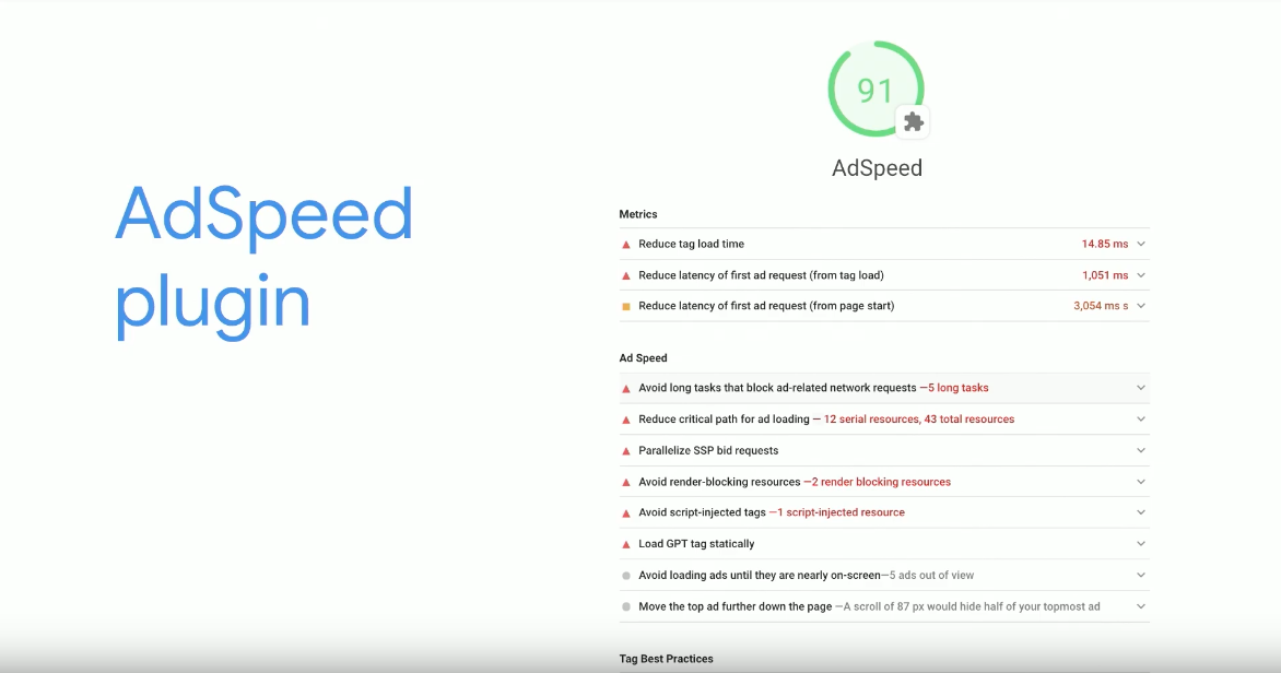
Leveraging the power of Lighthouse, the newly launched Lighthouse Plugins will enable you to extend the function and measure the metrics that you care about the most. Using node modules, an additional set of checks will be implemented and run through a normal Lighthouse audit and added to the report as a new category.
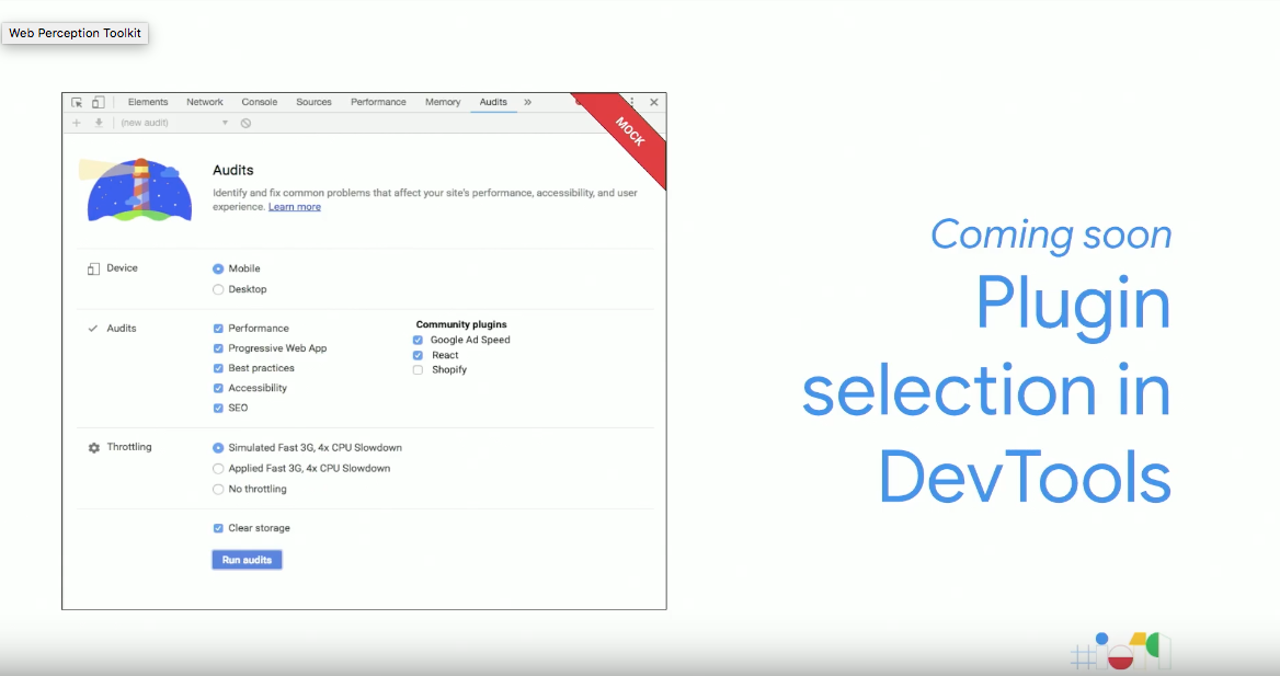
The first plugin, AdSpeed, is available now, with new plugins set to be introduced over the coming months.
Action 15: Quantify the performance metric of every pull request
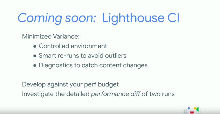
The final action in the blueprint was described as the most robust method to defend against regressions. This can be achieved by implementing performance measurement through Continuous Integration, which is now easily achieved using the new Lighthouse CI, which is coming soon. This will allow you to develop against performance budgets set and minimise variation by investigating detailed performance differences of two runs within a controlled environment, with diagnostics to catch content changes.
This 15 step blueprint was created to help measure, optimise and monitor performance like a pro with actionable steps and tools to achieve this success.
What’s New With Chrome and The Web – Dion Almaer & Ben Galbraith
Talk Summary
Google’s Dion Almaer and Ben Galbraith, covered the latest updates across Chrome and explained the upcoming tools that are being built as the team continue to work on the three major goals they have to improve the evolving web platform;
- Enable users to browse the web instantly, no matter where they are in the world, to ensure people keep exploring and finding new content.
- Expand the power of the web to enable everyone to find all of the world’s information and services on the platform, bringing their vision of ‘everything connected to everything’ to life.
- Ensure everyone navigating the web is kept safe.
Speed – The Instant Web
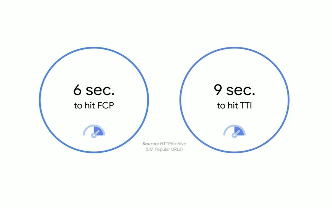
With broadband and increasingly fast connections readily available, it seems like the instant web is here. However, looking at real-world data it appears this is far from the case. Stats from HTTP Archive, which retrieves information from 5 million URLs all around the world, show that on average it takes 6 seconds to hit FCP and 9 seconds for a site to hit TTI. Considering other areas of the world with poorer connectivity, as well as older or entry-level devices, this can take even longer.
Web pages are only getting bigger, having nearly doubled in size over the past three years, and users are becoming increasingly sensitive to loading time, with just a one-second delay impacting conversion rates by up to 20%, so Google has invested a lot of energy to help improve the performance of sites.
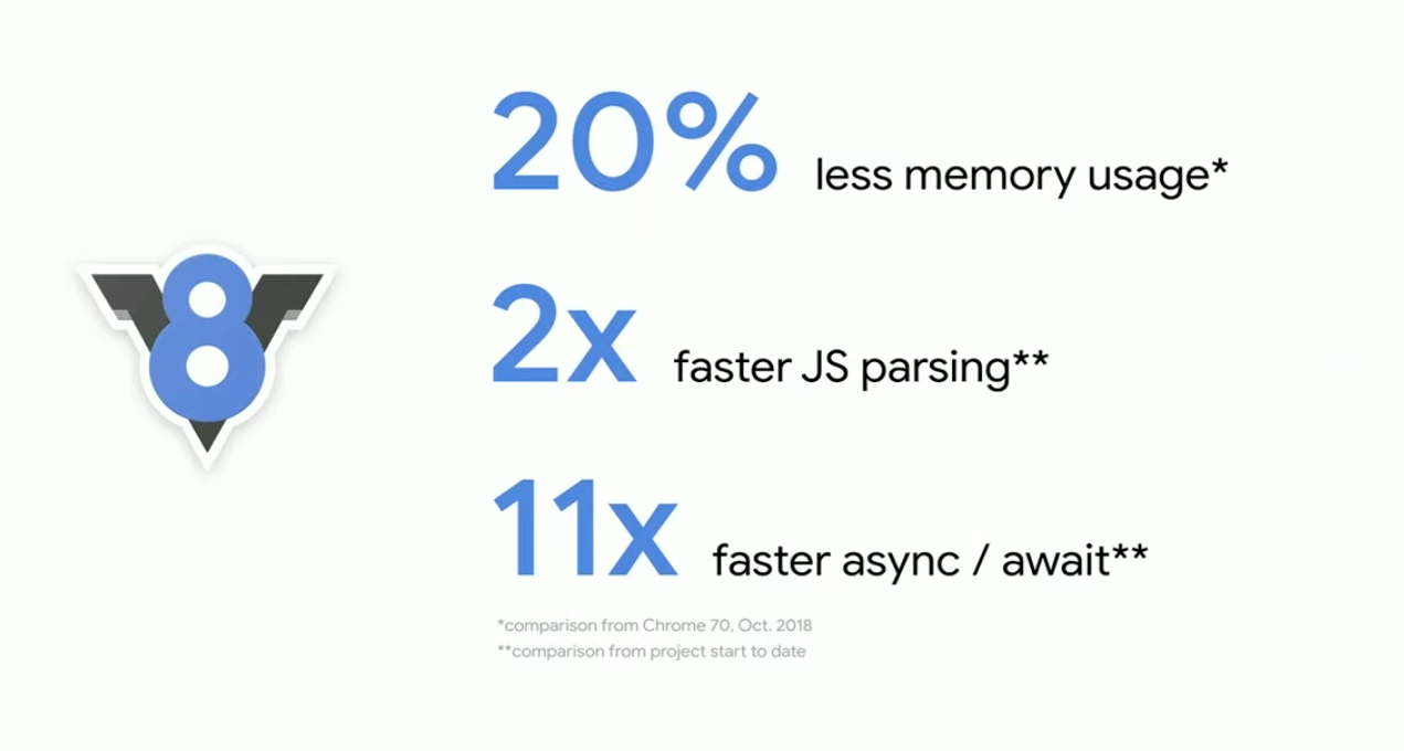
One example of this is the optimisation of Chrome’s initial page load performance, with improvements made to their JavaScript engine V8. This enables great features, including async/await, to get a lot faster.
Lazy Loading
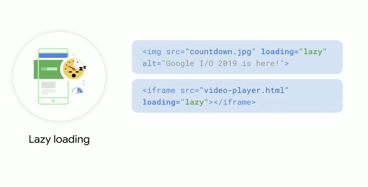
Lazy loading for images has also been introduced, which works by loading only the images that are required for the user to see, as well as automatically managing the loading of new images as a user scrolls. This is now easily achieved by adding the new loading lazy tag to the image tags and allowing Chrome to manage the rest.
This feature is also being extended to iframes, so additional content including video players can now also be lazy loaded. This is available in Canary and can be used today.
Enhancements to Lighthouse
The team has seen that successful Developers are continually measuring their websites and setting performance budgets to achieve improvements to both business metrics and user engagement. Due to the success they have seen, Google has added support within their Lighthouse tool.
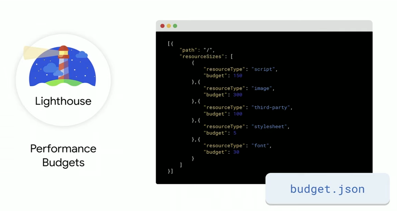
This is easy to set up by adding configuration within a JSON file and integrating it with Lighthouse and the Continuous Integration server.
The New Google Search Console Speed Report
Using data from the Chrome User Experience Report, a new Speed Report has been introduced to Google Search Console, providing insights at the URL level, along with aggregated recommendations for how groups of pages can be improved.
You can sign up to be a tester for the beta version of this report here.
New Page Transition Experience with Portals
Introduced as ‘iframes that you can navigate to’ Portals can be used to offer fluid and composed journeys within a single site, or across various other sites. With integrations including ‘Adopt Predecessor’, the origin page can share context with the destination page and appear in the background, allowing users to easily navigate back. ‘Portal Activate Options’ also allows information to be sent from the origin page to the destination page.
A Powerful Web
Once the website has delivered a fast loading time and successful performance experience for users, it is then important to consider what the user can do once they are on the site.
Web Perception Toolkit
Google is continuing to introduce new APIs, including the new Web Perception Toolkit, allowing access to information from real-world objects using QR or barcodes.
The Web Perception Toolkit involves the use of a camera feed, which can scan a code from any product and load an information card with further details within a PWA.
Upcoming Capabilities
With the vision of being able to link everything together while threading the needle between power and safety, upcoming capabilities include;
- Google Duo – Chrome 76 introduces an installation prompt for PWAs, which will allow users to install web apps to their desktop
- Duplex on The Web – Using Machine Learning, Duplex on The Web will help users complete actions on a website, with the content shown in their native language.
Other exciting projects currently in development include:

Cookie Changes
SameSite Cookies will be rolled out over the next couple of months, which will introduce changes to how cookies work in Chrome to support transparency and control. Currently, the cookies used within Chrome are visible in both first and third party context, which leaves cookies more broadly exposed.
Moving forward, using SameSite Cookies, Chrome will make all cookies limited to first-party context only and will require developers to explicitly mark if a cookie needs third party visibility. This provides a clear distinction between the two and further enhances security. Other privacy changes coming to Chrome include:
- Blocking fingerprinting as a commitment to user privacy.
- WebAuthn to secure sensitive information.
- Two-factor authentication for PWAs.
Modern Web Testing and Automation with Puppeteer – Joel Einbinder & Andrey Lushnikov
Talk Summary
In this session, Chrome DevTools engineers Joel Einbinder and Andrey Lushnikov shared how Puppeteer can be used to test modern websites in different browsers, as well as highlighting other interesting use cases for headless Chrome. One thing which is clear from their talk, is that the modern web is easily testable with Puppeteer.
Key Takeaways
- Modern websites and apps are easily testable using Puppeteer.
- Testing with Puppeteer is fast, reliable and simple.
- Puppeteer is now available for Firefox, while currently an experimental project, it already supports 90% of Puppeteer APIs Puppeteer can be used to automate testing, monitor performance and diagnose issues.
- Through Puppeteer it is possible to test a website’s performance and accessibility.
What is Puppeteer?
Puppeteer is an automation library solution, allowing control of headless Chrome over the DevTools Protocol with simple to use APIs. There are several things which can be achieved using Puppeteer including open pages, the ability to navigate websites and evaluate JavaScript, as well as automated testing and diagnosing performance issues. Puppeteer has been around since 2017 and is used by organisations including Google, Netflix and Facebook internally to drive performance analysis.
Another browser is joining the Puppeteer family
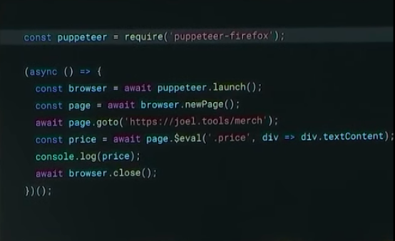
Originally, Puppeteer was only available to use on Chrome, but it is now coming to Firefox too. Currently an experimental project, Firefox already supports 90% of Puppeteer APIs, and the team is working closely with Mozilla to release this and support more of the APIs.
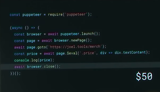
It’s fairly simple to convert the script from Puppeteer to Puppeteer Firefox, only one line requires changing from ‘puppeteer’ to ‘puppeteer-firefox’.
Before:
After:
New Web Testing Powered by Puppeteer
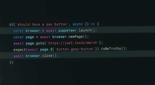
We all know how important it is to test a site before launch, however, cross-browser testing can slow these down due to the need to launch a new browser for every test, to keep them isolated.
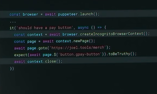
With Puppeteer these tests can now be completed faster due to an API called ‘Browser Contexts’ which is based on Chrome’s Incognito mode. Using the Browser Contexts API, testing can become 100 times faster while still ensuring browsers are isolated.
This is achieved by moving the browser launch call outside of the test, before creating a new incognito browser context.
Before:
After:
Testing With Puppeteer
Testing with Puppeteer is fast, reliable and simple and there are several things which are currently able to be tested including mobile, performance and accessibility testing.
Testing The Modern Web
The modern web has seen an increase in web apps, with high importance also being placed on performance and accessibility.
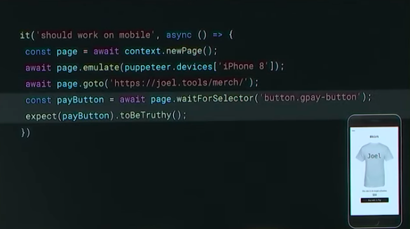
Mobile Testing
With Puppeteer, extensive device emulation can be achieved to ensure the mobile version of a site performs as expected and doesn’t regress over time. Over 100 devices are available to be emulated to make sure pages and important actions perform successfully on mobile.
Testing Offline Support
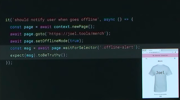
While critical for certain types of web applications, every website can take advantage of offline mode (Google Maps for example). Puppeteer enables you to test that a website successfully works in offline mode. This can be seen in the example below, where a red box is shown when a website is visited while a user is offline;
Network Monitoring
Network monitoring can be achieved through the DevTools Network Panel, to review network requests, activities and status codes. However, this is also possible through Puppeteer which provides two events; request and response, recreating the DevTools Network Panel, but programmatically. Puppeteer enables you to query for Headers, POST data, Content and to check if a response is coming from cache or a Service Worker.
Performance Testing
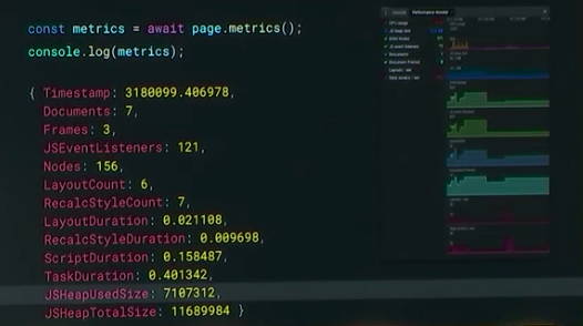
Puppeteer also has APIs available to automate performance testing through metrics, Chrome tracing, and code coverage. The page metrics produces the same as the Performance Monitor in DevTools giving an overview of a number of metrics on your site, enabling you to monitor them and ensure they don’t regress.
Accessibility Testing
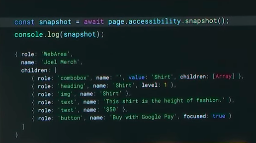
While having a fast website is important, it also needs to be accessible. Manual testing for accessibility is hard to automate, but with Puppeteer it is possible to test, monitor and automate through the ‘Page Accessibility Snapshot’ API. This provides the accessibility tree found in Chrome, which is the same object sent to assistive technologies to inform them of the content on the website.
Thanks for reading our Google I/O 2019 recap, we hope you learned some valuable information to apply to your own business and to further your own learning. If you want to keep up to date with the latest Google developments, be sure to read our Google Webmaster Hangout notes and sign up to our newsletter to get the latest news in your inbox.
Get the latest insights from Google in your inbox

