Google Search Console (GSC) is an essential tool for search marketers, assisting with a great many SEO tasks. Despite its necessity, many SEOs struggle with GSC’s clunky interface, being aptly labelled “the ugly step sister to all other Google products”.
Although an update is on its way, let’s take a look beyond GSC’s rough edges and walk through how you can optimise your site for mobile search.
1. Using GSC to identify device traffic mismatches
First out to bat is a simple check you can do if you have a separate mobile and/or AMP configuration to quickly find out if your site’s committing the cardinal sin of mobile optimisation – ranking for pages on the wrong device.
If you have a separate mobile website, or AMP site on a separate domain, you’ll need to switch between your desktop and mobile properties.
For AMP configurations using a separate URL path on your main site, you’ll be able to filter down these pages within a single property.
And if you have a responsive site only, kick back and relax and reflect on all of your great life choices.
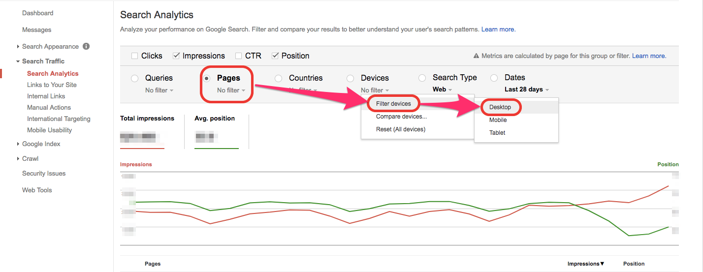
To check if you’re getting desktop traffic on your mobile site:
Navigate to the GSC property where your mobile site is located, and filter down Device to Desktop.
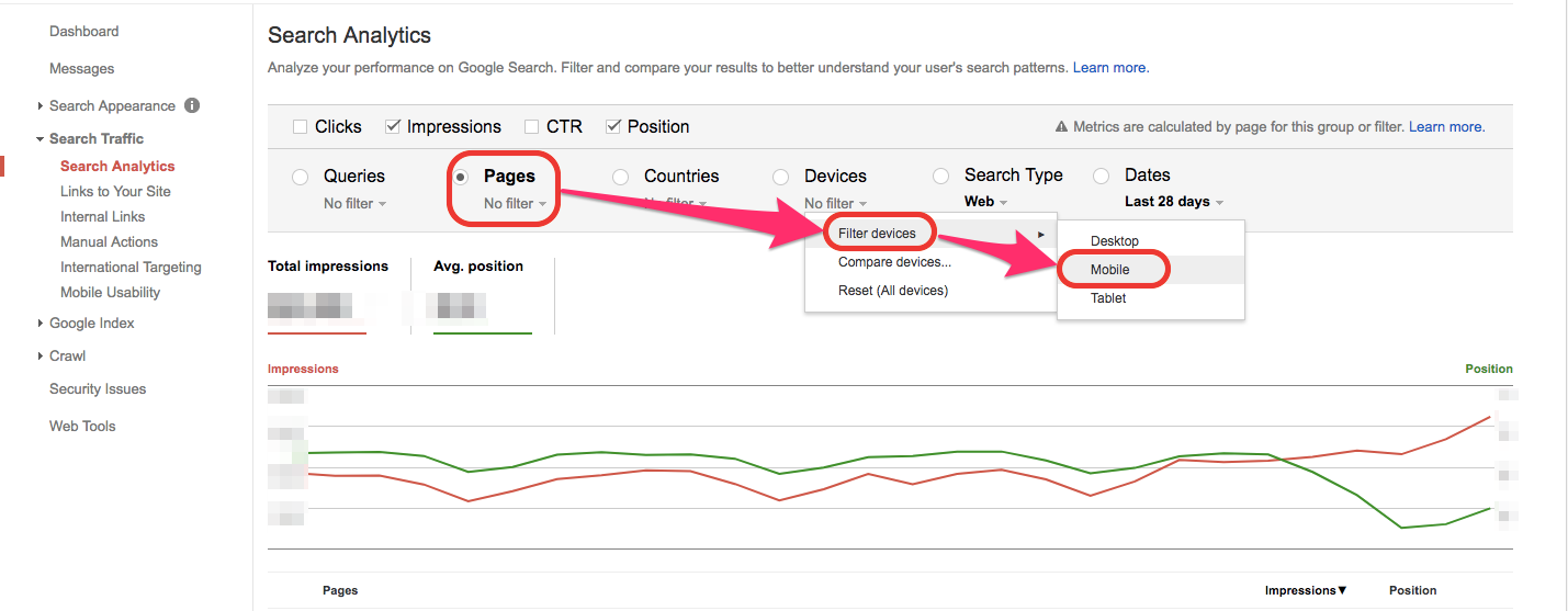
To check if you’re getting mobile traffic on your desktop site:
Navigate to the GSC property where your desktop site is located, and filter down Device to Mobile.
To check if you’re getting traffic from AMP pages on your desktop site:
Navigate to the GSC property where your desktop site is located, and filter down pages to only show URLs containing “AMP”.
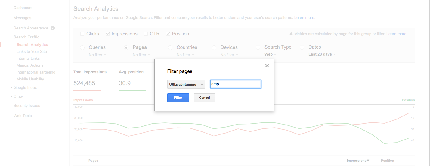
If there are any pages that show any impressions or ranking in any of these scenarios, it’s likely you have a configuration error. Make a note of them, then use a site crawler like DeepCrawl, to better understand your mobile configuration and find out if there are errors in your setup.
Once any technical errors have been fixed, repeat the same check again once the Search Console data is updated, to ensure that the right site is being indexed for the right device.
2. Checking AMP Page Indexation and Validation
The Accelerated Mobile Pages report hidden away at the bottom of the Search Appearance category is useful in two ways for sites with AMP configurations.
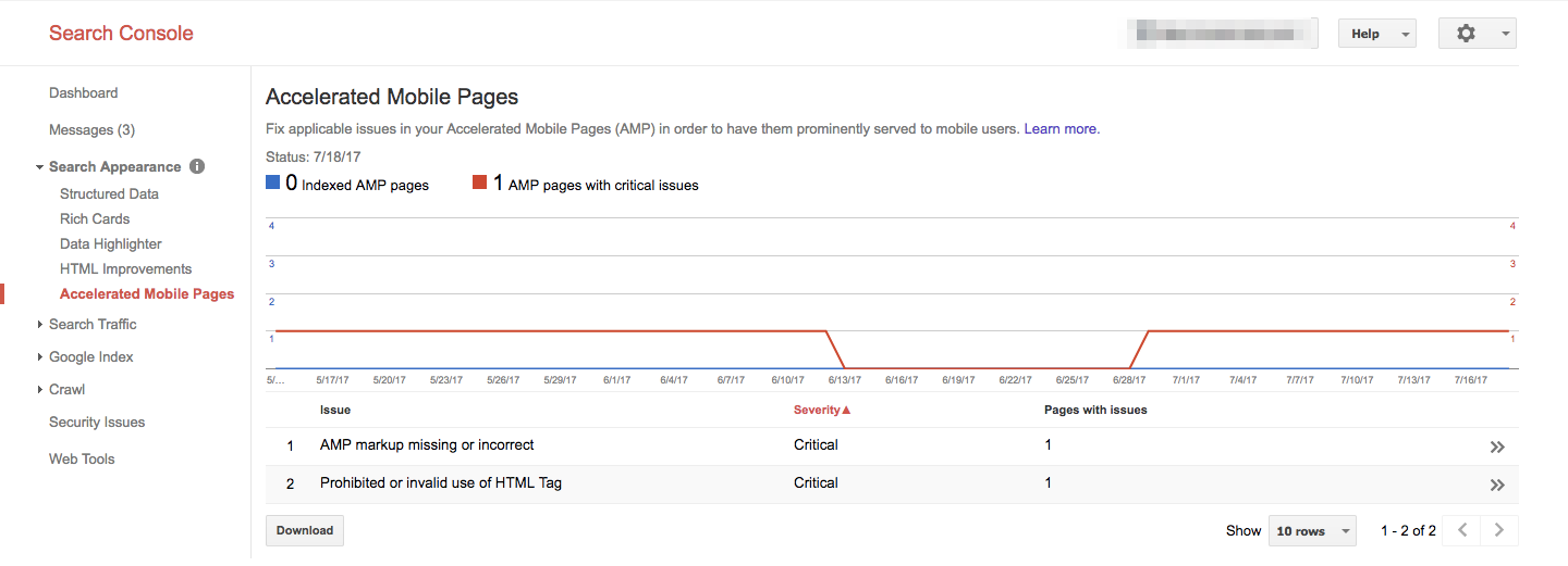
Firstly, you can check how many of your AMP pages are indexed by Google and how this has changed over the past two months.
Secondly you can identify a range of critical and non-critical issues with your AMP pages, including:
Critical issues:
- Prohibited or invalid use of HTML Tag
- Prohibited HTML Tag with AMP equivalent
- User-authored Javascript found on page
- Invalid usage of AMP tags
- AMP markup missing or incorrect
- Invalid CSS stylesheet
- Invalid layout property found in AMP tag
- Major content mismatch
Non-critical issues:
- Invalid structured data element
- Content mismatch between AMP and canonical pages
- Add AMP structured data (if supported)
- Minor content mismatch
- Use of deprecated tags or attributes
- AMP page domain mismatch
- Content mismatch: Missing embedded video
If your AMP pages have critical issues, you will need to drill down into these pages to get more information, and refer to Google’s AMP documentation to understand and then fix the errors.
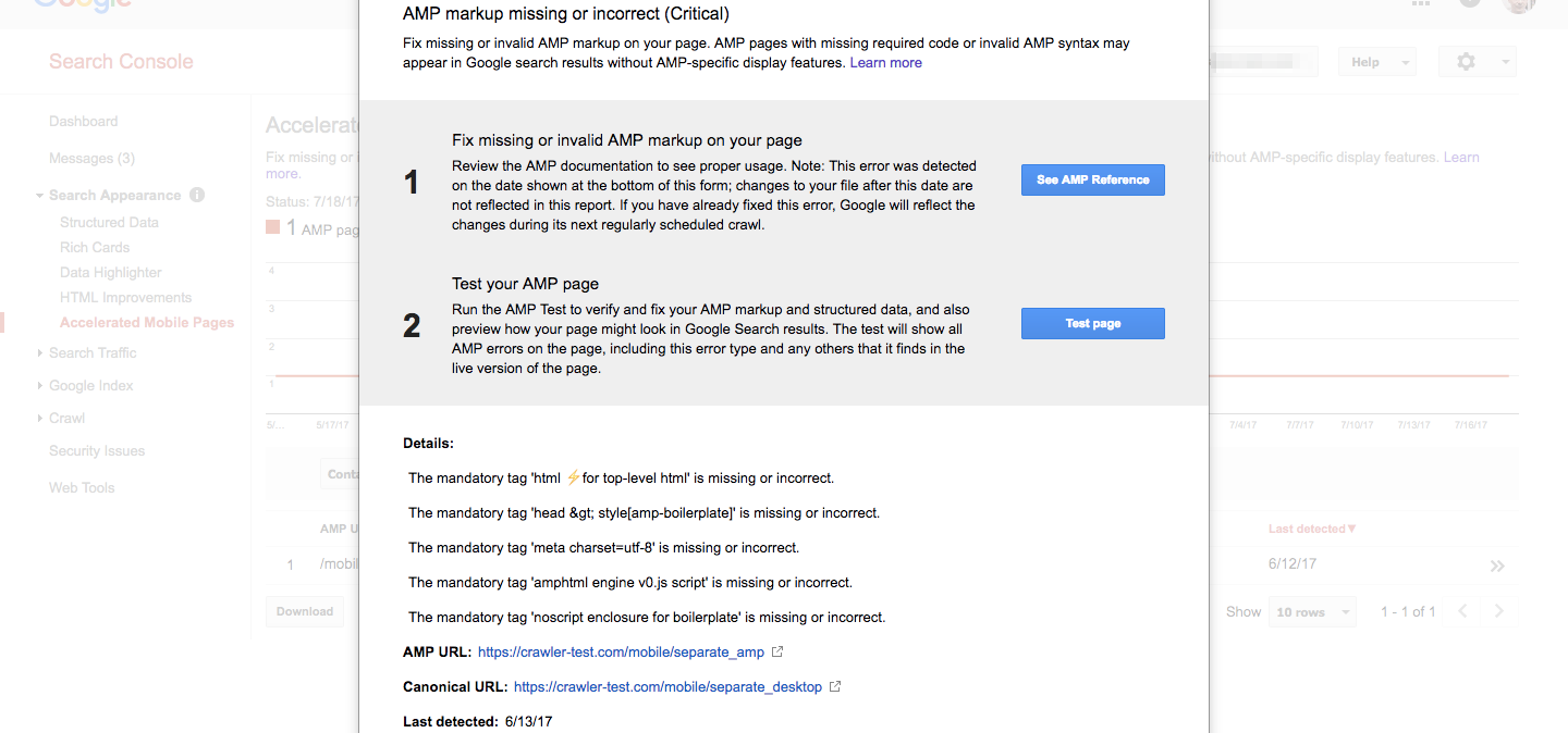
It’s important to note that these critical issues may still appear in GSC after you have applied fixes because Google has not yet re-crawled the page. However, you can test individual AMP pages using Google’s AMP Test tool to get an immediate answer as to whether these issues have been fixed or not.
3. Use HTML Improvements to Check for Mobile Specific Issues
Another report which you can use for mobile optimisation in the Search Appearance category is the HTML Improvements report. This report can be used identify issues solely impacting your separate mobile site.
Specifically, HTML Improvements will tell you if your title tags and meta descriptions are too short, too long, duplicated, missing or not informative. This report will also flag non-indexable content such as rich media files, video, or images.
Drilling down into the specific issues will list all pages which need to be improved and can be downloaded into a spreadsheet.
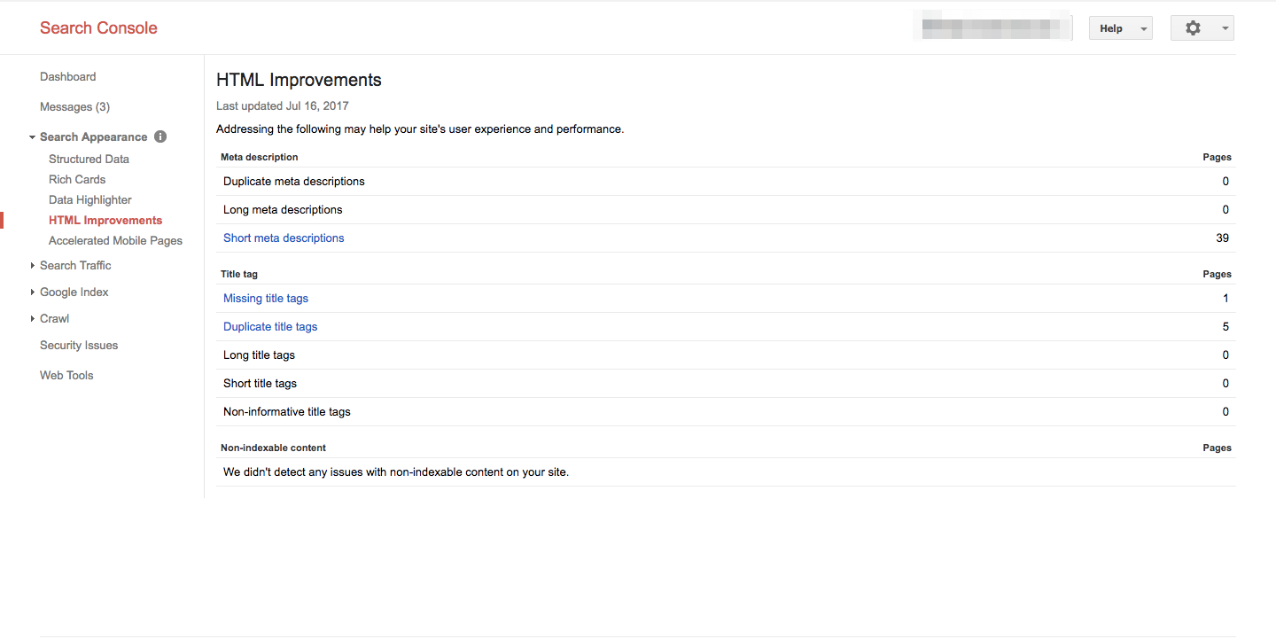
After looking at this report for your separate mobile site, you can switch between properties to see if these issues are replicated on your desktop site or if they only exist on your mobile site.
4. Uncover Usability Issues Impacting Your Mobile Users
In a similar way to the Accelerated Mobile Pages report, the Mobile Usability report will list issues affecting user experience on mobile. Again, this report in GSC will show you the number of different issues over the past couple of months. You can also see how many pages are returning the errors specified in the report.

Here’s a list of the most common mobile usability issues that GSC will flag:
- Clickable elements too close together
- Content wider than screen
- Text too small to read
- Uses incompatible plugins
- Viewport not set
- Viewport not set to “device-width”
Using the same method as described in the AMP validation section, you can click on the issues that GSC has found and get more detail.
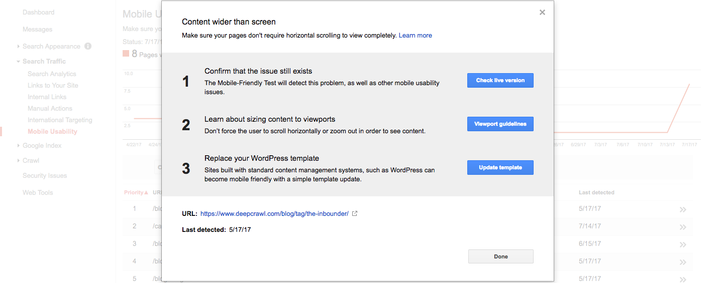
Once a fix has been made, you can check the live version of the page to get near instant feedback on whether the issue is still present rather than waiting for Google to recrawl that page.
5. Checking for Crawl Errors and Blocked Resources on a Separate Mobile Site
GSC can be used for a further couple of checks if you have a separate mobile site. Check the Blocked Resources report on your mobile property to make sure that none of your important pages are being blocked to Googlebot.

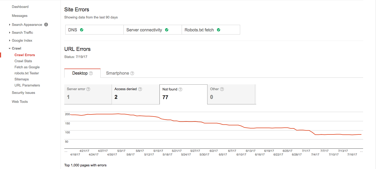
Secondly, you will want look at the Crawl Errors report to find site and URL errors. If you have a separate mobile site, you will want to make sure that there aren’t any crawl errors on an incorrect device e.g. there should be no desktop errors on the mobile site vice versa.
6. Fetch as Google – Test for Desktop and Mobile
The final mobile optimisation tip in our Google Search Console repertoire is to use the Fetch as Google tool to understand how Google sees your website using different crawlers.
Navigate to the Fetch as Google report under the Crawl category to request that Google fetch and render any page on your site so you can see it through Google’s eyes. This can be utilised as a last step so you can find any user experience issues that may have been missed in previous reports.
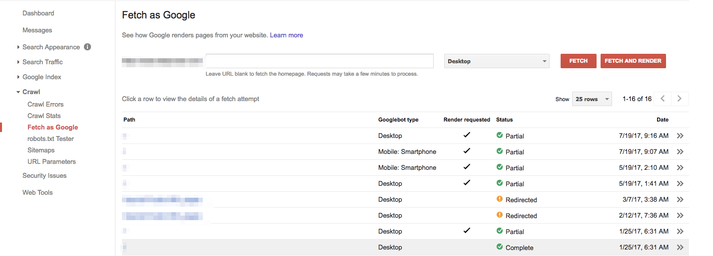
For mobile optimisation, in particular, you can request that Google fetch and render URLs using a mobile crawler and then compare how a user would see the site against how Googlebot renders it.
Gaining Full Mastery of Mobile
Google Search Console is a massively important tool but mobile optimisation doesn’t end there.
At DeepCrawl we are continuing to develop mobile specific reports and features that make your life as a search marketer that much easier – and don’t forget you can pull GSC data directly into DeepCrawl with our integration.
In recent months we’ve released a whole host of reports that provide you with insights into your site’s mobile configuration and mobile issues.
And just this week we introduced a number of Mobile Alternates Reports that make it easier to identify indexability issues affecting separate mobile websites.
Go beyond GSC and try out Lumar to gain full mastery of mobile.


