How Can our Graphs Benefit You?
Our brand new Graph features will allow you to:
- Navigate between related reports with ease by drilling down into specific reports from Breakdown graphs
- Quickly interpret data from your crawls to help you use your time more efficiently
- Gain a fuller understanding of your site by enabling you to visualise crawl data from multiple related reports simultaneously
At DeepCrawl we understand that your time is limited, meaning that it is crucial we present our comprehensive crawling data in a way that lets you uncover website issues as quickly as possible. In fact, this sentiment was backed by the feedback from our recent Net Promoter Score Survey, where we learned you would like to see more graphs and visualisations in our tool.
Being the attentive innovators that we are, our Product and UX teams went to work to address your feedback and have created a more visual DeepCrawl. With the fruits of their labour now available for all to see, we are excited to announce the launch of our new product-wide Graphs.
Introducing our All-New Graphs
Head over to the DeepCrawl App and take a browse through the different sections of the tool to find our new graphs located at the top of each of our Reports and Overview sections.
Our new graphs are designed to visualise issues across multiple related reports as well as making it easier to navigate between related reports.
Breakdown Graphs
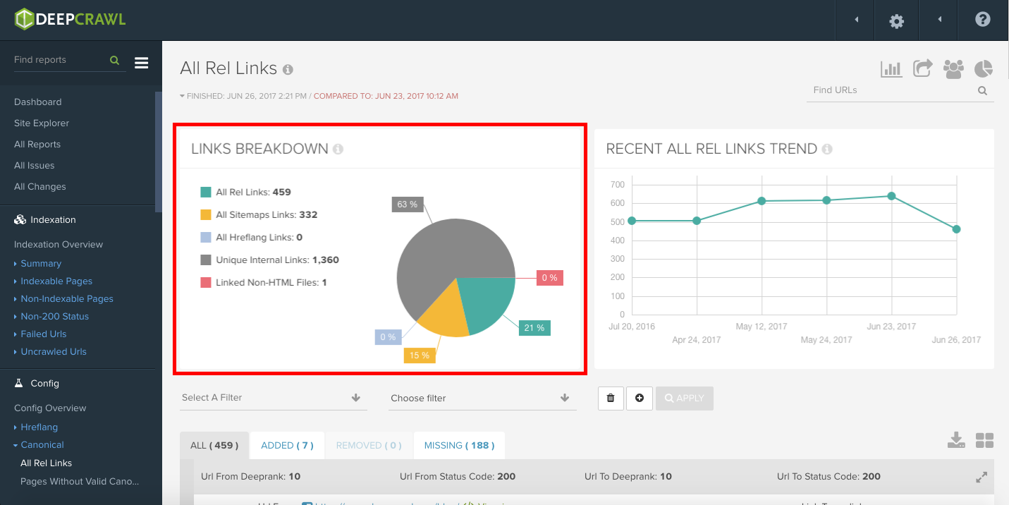
Breakdown graphs, like the one pictured below, provide a quick and easily digestible summary of the relative distribution of pages within an exclusive set of categories. These graphs display a relative distribution of a group of categories according to a specific metric shown as a percentage in a pie-chart.
In the example below, the links found in this particular crawl are broken down by source and displayed as a percentage.
Related Reports
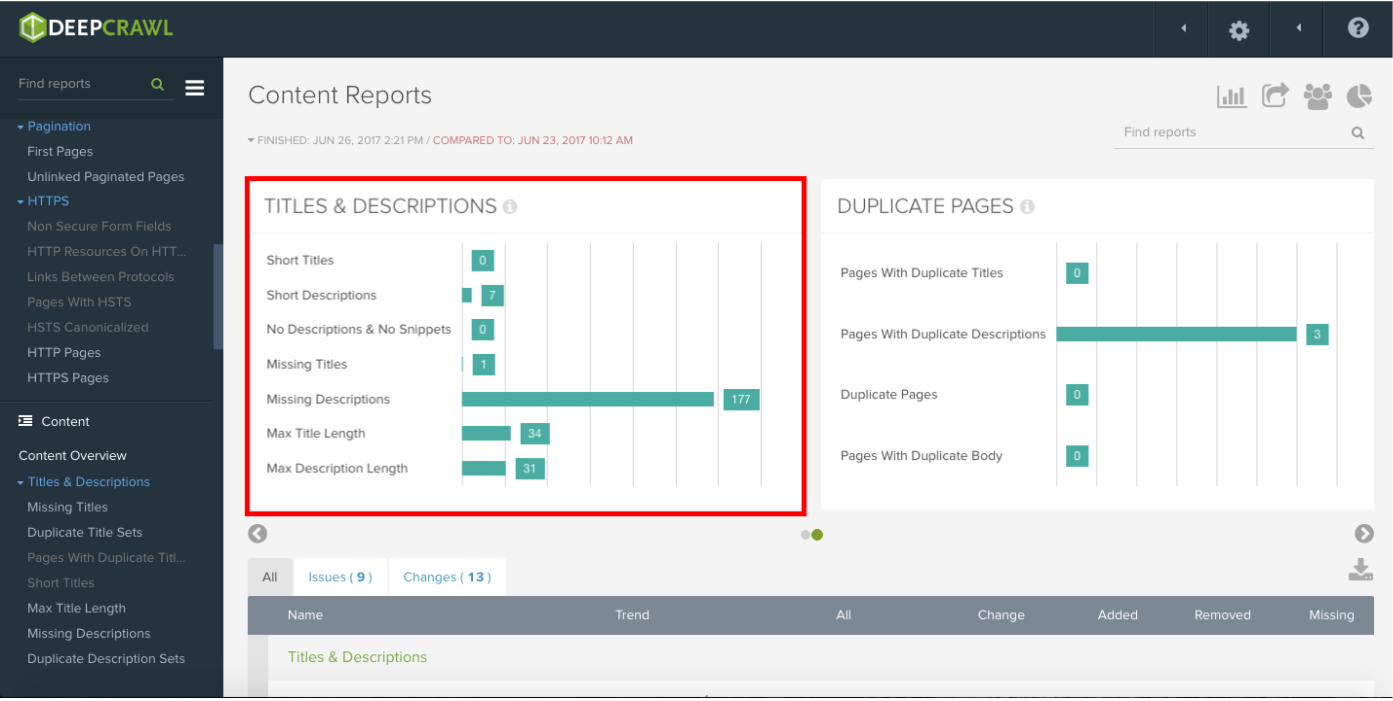
The second graph type we’ve added is the Related Report. Displayed as bar graphs, Related Reports group together related reports and provide a handy way of travelling from report-to-report rather than locating each one individually via the navigation menu.
The example below shows a Related Report displaying the number of pages with different categories of title and description issues.
Trend Graphs
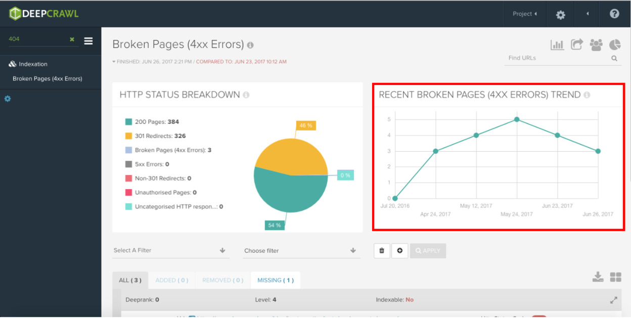
Trend graphs might not be a new addition, but nonetheless they are a great way of showing how different metrics vary from crawl-to-crawl to give you a clear view of trends in your crawl data. In the screenshot below you can see how the number of pages returning a 404 has changed in the Recent Broken Pages Trend Graph.
The Devil is in the Detail
With all of these colourful graphs hogging your attention, there are a few finer details that you might miss at first glance.
Graph Scrolling
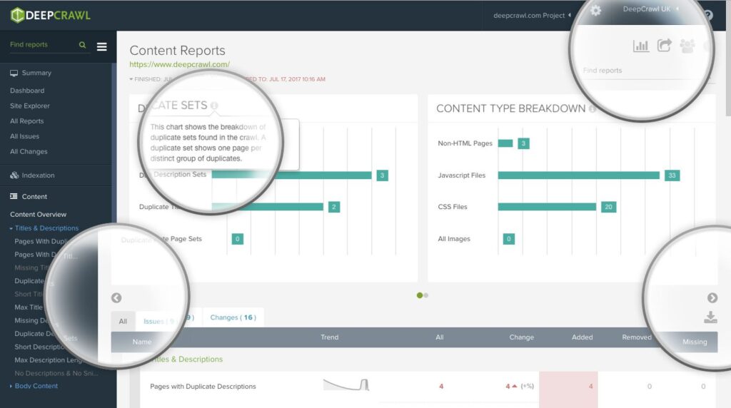
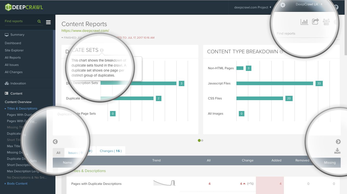
Graphs are only ever displayed two at a time so that you can clearly read and interpret each of them, but that doesn’t mean that that’s your lot. Clicking on the grey arrows (as pictured below) below graphs will cycle through all of the available graphs related to that report.
Graph Explanations
Not sure what’s included in a graph? No problem, simply hover over the information icon to the right of the graph title for a detailed explanation of how to read the graph.
Toggle Graphs
If you’re focus is on drilling down into the detail of your crawl rather than gaining a top level overview, we’ve got your back. Look to the top right of any section of DeepCrawl and you will find a Toggle Graphs icon allowing you to switch Graphs on and off. Switching Graphs off will do so at a global level, meaning that you won’t see them anywhere within the tool.
A Penny For Your Thoughts
We’ve launched Graphs in response to your feedback and hope that it improves your experience while using our crawler. However, there’s always room for improvement and we’d love to hear your thoughts on our new Graphs.
Have you got ideas for new Graphs or an opinion on how we can better present our crawl data? We want to know. Ping us over a message or hit us up on Twitter, Facebook, LinkedIn or Instagram.
