Introduction
Color contrast is a key part of testing for accessibility issues on your website. However, many solutions are limited in their capability to test the color of text in certain situations, like text over images. This results in a significant number of issues needing to be manually checked, which most teams simply do not have the time for.
That’s why, when building accessibility metrics for the Lumar platform, we were keen to enhance color contrast reporting to remove as many of these false positives as possible, and allow accessibility teams to focus on getting real issues fixed.
In this product guide, we’ll give you a bit more information about how we test for color contrast issues, and how we’re reducing manual checks by an average of nearly 90%, saving over 8.5 hours of time.
Manual Color Contrast Checking
Most color contrast checkers are calculators that allow users to plot in the text color and the background color—usually with a color dropper—to tell you if the contrast is compliant with WCAG AA or AAA.
As a manual process, this is very time consuming as you can only check one element at a time. However, it’s also not entirely accurate as color droppers don’t always reflect the true color, and these tools don’t always take into account the text size or weight, which can have an impact on compliance.
Automated Color Contrast Testing
With automated solutions, all elements on a page are automatically checked to determine whether it passes or fails WCAG AA or AAA requirements. However, some tools are only able to run these tests on one page at a time, and often can only check single color backgrounds, so text over images would still require manual checking. These tools are also often unable to correctly identify page elements, so require a lot of manual intervention.
Lumar’s Color Contrast Testing
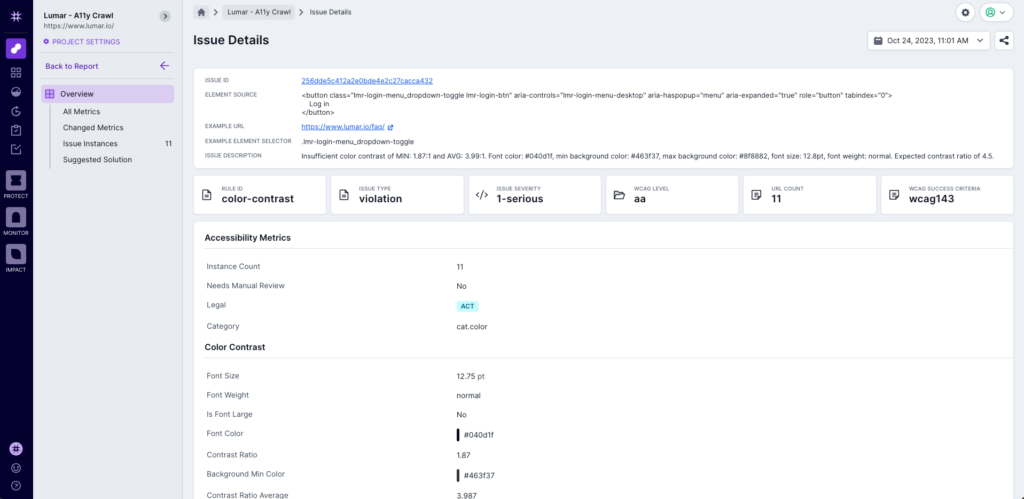
Lumar overlays our own proprietary technology on top of the leading digital accessibility library, which allows us to identify page elements that most tools cannot, which reduces the need for manual verification. We also pull colors directly from the CSS where possible, and run multiple color contrast checking algorithms for maximum accuracy, which allows us to test text over images with a high degree of confidence. With separate desktop and mobile user agents, we’re also able to get accurate reporting based on different devices.

The Results
To check how our proprietary color contrast testing performs against the leading digital accessibility library, we looked at crawls of around 1,000 URLs each of 100 top websites that we use for our benchmarking feature. Here’s what we found:
- The average number of color contrast issues the leading digital accessibility library could not verify was 597. For Lumar, the average was 63. That represents an average reduction in required manual checks of 89.4%.
- Assuming 1 minute for each verification using a color dropper tool, reducing manual checks by 534 means time savings of 8.9 hours.
Want to Know More?
We’d be happy to walk you through our proprietary color contrast testing in more detail. Simply book in a demo and we’ll be happy to show you more.

