Lumar’s advanced mobile reports and features give a wide range of insights into your mobile configuration and issues, however there are several possible ways to include your mobile website in a crawl. This guide will walk you through the different crawl configurations and the insights you’ll get from each.
Separate mobile website
A separate mobile website is a situation where you have a desktop website, and another mobile website which is on a completely different set of URLs. Usually, this website is on a subdomain (such as mobile.example.com or m.example.com), or a sub directory (such as example.com/m/). Occasionally, it’s on a completely different domain to your desktop website (such as example.mobi).
For a separate mobile website to be SEO friendly, it must have specific rel=alternate and canonical tagging in place to let search engines know about the relationship between your desktop and mobile pages.
Google’s Separate Mobile Site Guide
In order to test this configuration, it is necessary to crawl both the desktop and mobile sites in the same project.
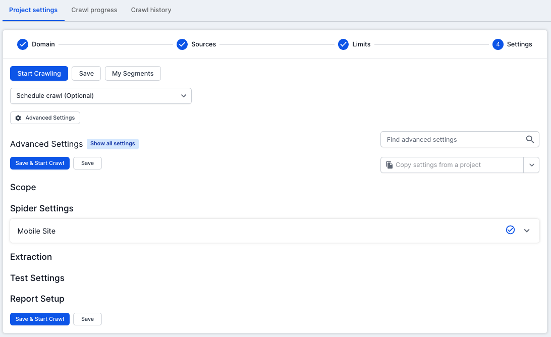
You can configure a project to include a mobile site correctly in Step 4 of the project settings (Advanced Settings > Spider Settings > Mobile Site).

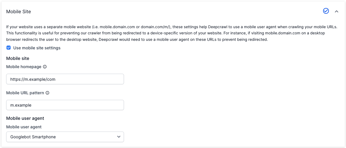
Entering a Mobile Homepage will ensure that the crawl starts on the mobile homepage in addition to any other start URLs specified in your crawl, and accurately report the depth of mobile pages. For example:
https://m.example.com/
https://www.example.com/m/
https://www.example.com/?mobile
If your mobile site is on a separate domain or subdomain, this will automatically be extracted from the mobile homepage, and added as a secondary domain.
The Mobile URL Pattern is used to match which URLs will use the mobile user agent instead of the default user agent setting. e.g.
m.example.com
example.com/m/
?mobile
Your Separate Mobile and Desktop Sites Redirect Based on User Agent
It’s quite common for a desktop site to redirect to a mobile site if the user agent used is recognised as a mobile device, and to redirect from a mobile site to a desktop site if the user agent is recognised as not a mobile device. This causes problems with a standard crawl, which uses a single user agent for every page and results in either the desktop or mobile site appearing in your crawl as redirects depending on which user agent you used.
You can specify a second user agent in the Mobile Settings which will be used for separate mobile pages and avoid the redirection.
Dynamically served website
A dynamically served mobile website is one where different desktop and mobile versions of a page are served from the same URL, i.e. for any page a desktop user will see different HTML or resources than a mobile user does.
Currently, the best way to find the difference between the desktop and mobile version of a dynamically served website is to crawl it with a desktop user agent, then recrawl with a mobile user agent:
- Create one project for your website
This will result in reports containing the pages which were or were not found on one of the website versions (Added/Removed/Missing reports), and differences in the linking architecture.
Check that your high value pages exist on the mobile version of your website
An important aspect of dynamically serving your website is ensuring that your high-value desktop pages have equivalent mobile pages. The “recrawl” method above works well in most cases, however if your desktop internal linking structure does not match the mobile architecture some pages may not be discoverable.
In addition to the recrawl method above, a list crawl should be run to ensure that high value desktop pages exist as mobile pages:
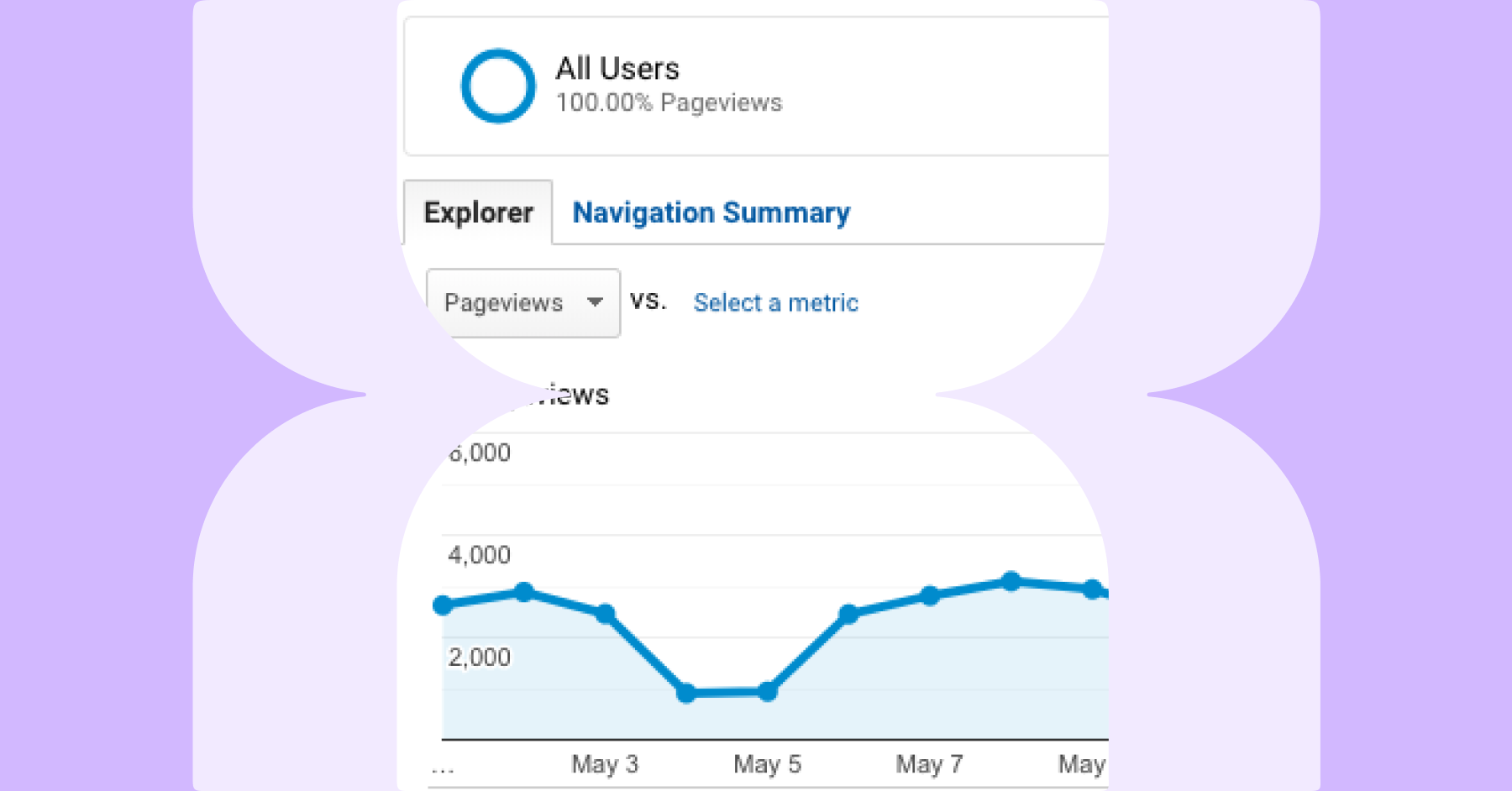
- Identify your high value landing pages – the easiest way to do this is to export a list of high traffic landing pages from your Analytics platform, or high DeepRank URLs from another crawl
This will surface URLs which were found on the desktop website but do not exist on your mobile website.
Google’s Dynamic Serving Guide
Responsive Website
A responsive website is one which uses one set of HTML and resources on one URL for both desktop and mobile users. Unless you have specific needs or want to get answers to specific questions from your crawl, you do not need to make any specific changes to your crawl to get mobile insights from Lumar.


