Last week we were treated to an expertly executed webinar about all things mobile with Bastian Grimm and Jon Myers. If you weren’t lucky enough to attend you can find a summary of Bastian’s presentation, the recording and his slides in our recap post.
The second half of the webinar brought about a ludicrous number of questions, so we thought we’d answer them in a post of their own, including some that Bastian answered outside of the webinar. Let’s dive straight in.
Seeing as load speed is important for mobile, are PWA and AMP more important than ever?
The problem with PWA and AMP is that Google is making a huge effort to place AMP as the one and only solution, but it’s not. First and foremost think about how you can make your website fast and then think about what you can do on top.
If you’re not a publisher then you don’t necessarily need to care about AMP. If you are a publisher then, yes, you need AMP to appear in the carousel, but for everyone else it could be a bonus but not required.
AMP is fast because they prefetch and prerender the AMP URL, but if they would not give that bonus then any other site can be as fast as AMP. AMP shouldn’t be the only solution, just make your site is fast and then think about whether these Google dependent frameworks are worth the effort or if they could be invested better in something else.
How does AMP compare with properly rendered mobile sites? Should you push mobile traffic to AMP pages or keep both?
The problem with AMP is that functionality is limited. There are lots of things that you can’t do on AMP as opposed to a regular site, tracking is still a problem as well as limited CSS and JavaScript coming from third parties. First and foremost, make sure that you can do what you need to do in AMP before asking that question.
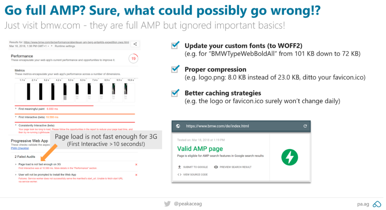
The AMP team has been pushing new custom components like crazy over the last 6-12 months so there is more functionality coming up. Airbnb have moved to AMP and BMW have fully moved to AMP, so they’re not even serving a regular site, their entire site is AMP markup.

What this does is set a framework which limits you from the get go. It’s important to note that you should understand what you’re getting into, before you adopt any new technology, especially if you do so in totality. Lest you give teams the necessity to work with performance metrics in mind, and the potential burden of being stuck with a Google-controlled framework that is 100% at their mercy. Bastian wouldn’t be willing to commit his site to that framework.
Is it necessary to create AMP sites for the main site and category section as well on a news site?
No, it’s not. You can test out AMP on a URL-by-URL basis. Don’t go crazy and scale AMP throughout the site, maybe try it out on a template or section first and see if that works for you.
In Bastian’s experience, the monetisation of AMP pages is way worse in comparison to a regular mobile site, so AMP is something to be tested with a limited set or on a URL-by-URL basis.
Don’t go crazy with AMP, if you want to try it out, test it out on a particular area first.
How will Google go about switching from discounting hidden and tabbed content on desktop and not discounting it on mobile? Will long-tail search be impacted?
Bastian believed from testing, that if content is hidden on the page it won’t rank properly in search, even if it is in the markup. Of course there are exceptions, but the majority of sites that have hidden content on desktop don’t tend to rank well for that hidden content. However, that’s not going to work on mobile because you have different UI elements like swiping, read more, expand etc. and Bastian is curious as to how this is going to play out from a spamming perspective.
Bastian recommends that if you have hidden or tabbed content on the mobile version of your pages to keep it, and see how it performs after the site has been switched to mobile-first indexing. More data collection is needed over the next month to see if Google’s statement is true.
There are different ways that you can implement tabbed or hidden content. However, the content needs to be in the markup CSS, styled and not part of an asynchronous request in a way that it’s not visible straight away.
Will CMS systems like WordPress be hindered because of plugins slowing down websites? How will Google’s Pagespeed update impact this?
The problem with the entire discussion around speed is that the desktop scores are treated as best practice. However, these haven’t changed that much in 5-7 years, caching has always been a thing. This isn’t new, but on mobile you still have to deal with a limited amount of bandwidth.
Generally all of the systems, like WordPress, are not good with performance out of the box. Performance needs to be part of a company’s DNA, no matter if it’s mobile first or a desktop only site.
Performance should be a part of each team’s benchmarks, like the UX and marketing teams to name a few, to ensure that this is being taken care of. If you take this approach then it doesn’t really matter what the system is, because if you have a setup that works then it doesn’t matter if it’s WordPress or not.
How much will mobile-first play a part in the ranking score compared to desktop? Is Google going to take desktop scoring into context alongside mobile? Or is it very much a mobile play?
Bastian says that at some point it will be a purely mobile play, it’s just a matter of how long it will take to get there. Google have said that it might take years for them to fully have that index switched to being mobile-first for all the listings and results. Google has moved over 20% of sites to mobile-first indexing, which means for one SERP there could be one or two being scored on the mobile-first logic, when the other eight are not.
Google have said that they are benchmarking performance based on the top ten search results but then some are based on desktop scores and some on mobile scores. Bastian has no clue about how they are going to do this and has been confused by Google’s decision to switch sites to mobile-first indexing partially. Bastian recommends that when you receive the notification that your site has been switched over, to make sure your website is top-in-class for mobile experience and mobile performance scoring.
Jon remembers at SMX Munich, when Google said that they were going to switch sites over to mobile-first indexing when they were ready. They can’t just flick a switch and move on because all hell would break loose in organic search!
Would you recommend having a native mobile site plus desktop or going completely responsive?
Google is recommending responsive sites because you have everything in the markup, no matter what viewport you’re using. This is really the biggest issue for Google as a lot of separate mobile sites have things missing, like canonical tags. It is partly that they are being lazy but also they want to ensure that they aren’t missing anything.
What Bastian really liked about the old-fashioned m-dot is that you could do mobile specific optimisations with much smaller and better optimised images, cut down JavaScript, compact CSS. That is way easier to optimise from a performance perspective. However, the drawback is that you have two different code bases to maintain, so responsive fixes that.
If you have the chance to go full responsive, Bastian would recommend this all over. Once you have it right, it definitely pays off. John would challenge the choice to go full responsive but it is a quick fix.
Do you need to reduce image quality for mobile and have a higher resolution for desktop? Is SVG a good option?
Getting images right is really hard for many reasons but partly because the formats are old and inefficient. There are new formats like WebP, JPEG XR out there but they haven’t been adopted yet. Bastian spoke about these in a recent talk at BrightonSEO and recommends image optimisation services like Cloudinary because they use new formats and they dynamically resize and scale images based on the resolution and viewport dimensions of the viewing device.
Do canonicals from m-dot to desktop need to be reverted with mobile-first indexing?
No. Google have answered that and said not to change rel canonical and rel alternate tags.
How is hreflang impacted by mobile-first indexing?
This is a very complicated topic and probably needs its own webinar. In Bastian’s opinion it is the single hardest thing to get right, especially if you have a separate mobile and multinational domains. Hreflang is a nightmare and it’s the reason why Google speak about it so much at conferences because nobody is getting it right. However, Bastian recommends that your site has parity between separate mobile and desktop sites.
Extra Reading: The After Hours Q&A
Unfortunately, there wasn’t enough time in the webinar for Bastian and Jon to cover all of the questions that came through. However, Bastian was kind enough to answer your outstanding questions after the webinar for some extra reading.
How are responsive sites indexed? Are they considered mobile?
Once Google has switched your domain over to mobile-first indexing, they’ll primarily crawl with their mobile user agent – however they do indeed understand that a responsive site is in fact what the name says it is: responsive; and therefore, reacting properly by sizing elements and such depending on e.g. viewport / screen resolution.
Seeing as site load speeds are important for mobile, would you say the use of PWA and AMP is even more important?
AMP URLs are perceived as extremely fast mainly due to the fact that Google pre-loads those from their search results. The 2nd page-view obviously won’t be as fast (see here for details).
However, a PWA can help with the 2nd (and following) requests as well since it actually allows you to do intelligent pre-actions (fetching/rendering/etc.) as well. Also, PWAs do have loads of other benefits (no need for a dedicated “mobile app”, etc.) – so it certainly can pay back to invest into a “PWAMP” setup, if you have the technical resources to do so.
How do we make sure following all practices are properly applied to a website to have it fully prepared for Mobile-first ready?
Make sure to follow the 10 tips and the end of my presentation and especially use DeepCrawl for large scale testing after you implemented any changes. Further, DeepCrawl’s mobile first white paper can help a lot.
Why would you like to check the rendering of our competitors sites?
Because I’m curious about loads of things. It doesn’t necessarily need to be competitors – can be any given site that doesn’t prevent iframing.
Will CMS’s like WordPress become hindered because of all the plugins they load that might potentially slow down the website? They report that 30% of the web is using it.
The more plugins (code) you add to any system, usually it becomes slower; that’s not a WordPress-only issue. I assume what you’re talking about is that often times those plugins also introduce their own CSS and JavaScript files which certainly have performance impact (due to adding more HTTP requests, which often times are render-blocking)?
In an ideal world you’d not have that, however from a practical standpoint a solution would be to use one of the more popular caching solutions such as WPRocket or W3Ctotal – both also allow to combine those files (on the fly) so the impact of adding plugins is at least reduced. But please don’t go crazy now – what you don’t need shouldn’t be there in the first place.
How do you test what pages are indexed in mobile vs. desktop. i.e. is there a different “site:” command to test pages in the mobile index vs. general index? If a site is responsive is it by default included in both?
To my knowledge, there is no different search operator for this. And again, please understand it’s just one index. Only the content they rank you with is either going to be “mobile” or “desktop”. You’ll have to wait for the respective notification in Google Search Console to understand if a site has been switched over. Further, you could watch your logfiles to understand when the crawl volume of Google’s mobile bot massively increases (and desktop decreases simultaneously).
Do you recomend ‘native mobile sites’ instead of ‘responsive versions’?
As Jon and I mentioned during the webinar, Google is heavily advocating responsive sites over all other potential setup. Though it won’t mean the others don’t work. Native mobile – as in having a dedicated m-subdomain for example – makes performance optimisation sometimes easier.
Responsive on the other hand has this one code base, is usually way easier (and less costly) to maintain, etc. – so it really depends on your setup and requirements. Generally, I do like responsive sites if done well.
What are your thoughts on Schema.org markup?
I like using schema markup whenever I feel it would help to provide additional meaning to content on a given site. I am not crazy about marking everything up but certainly it can help to understand context better (e.g. is a number a zipcode, a phone number or something entirely different). So I’d generally recommend using it, if you can. But do it natively (and not using GSC), that way it also helps with other engines/devices.
With voice search set to reach parity with mobile search in less than half the time it took mobile to overtake desktop, should we be looking at the shift to mobile first as a stepping stone to voice first rather than relaxing when we get a passing grade for mobile? If so, should our major focus be in following developments in markup and speed above all other aspects?
I’d say that’s not a bad plan… Certainly there is no one size fits all answer but since a big chunk of “mobile” searches are in fact done by “voice,” I’d totally think further than just building for mobile devices now.
What happens if 80% of your traffic comes from desktop? Do you still have to optimise for mobile users?
Well of course most effort should always go to your core target audience; if that’s desktop I’d totally make sure to invest a significant amount of my time to make this offering as good as it can be. However, the “remaining” 20% should also have a seamless user experience – thus I’d still recommend to not forget them entirely. And I’d also assume that this will be increasing, so it should be time well spent.
Now that we are accustomed to scrolling (with different mobile devices) and with this new mobile-first approach from Google, Is the “above the fold” a thing of the past?
As long as there is a screen and we’re not talking about screenless searches, there’s always going to be an “above the fold” – which for example is super important when it comes down to web performance optimisation (see my BrightonSEO deck & the DeepCrawl recap for details). Plus it’s the first “thing” people see; so I’d say it’s still very important.
Complete your understanding with our mobile-first indexing whitepaper

We’ll be publishing a post of Bastian and Jon’s answers to your mobile questions shortly. In the meantime, have you read our comprehensive white paper on mobile first indexing, covering everything you need to know about Google’s big update?


