Learn how to find, fix, and prevent common website accessibility issues in this session of Lumar’s ongoing website intelligence webinar series.
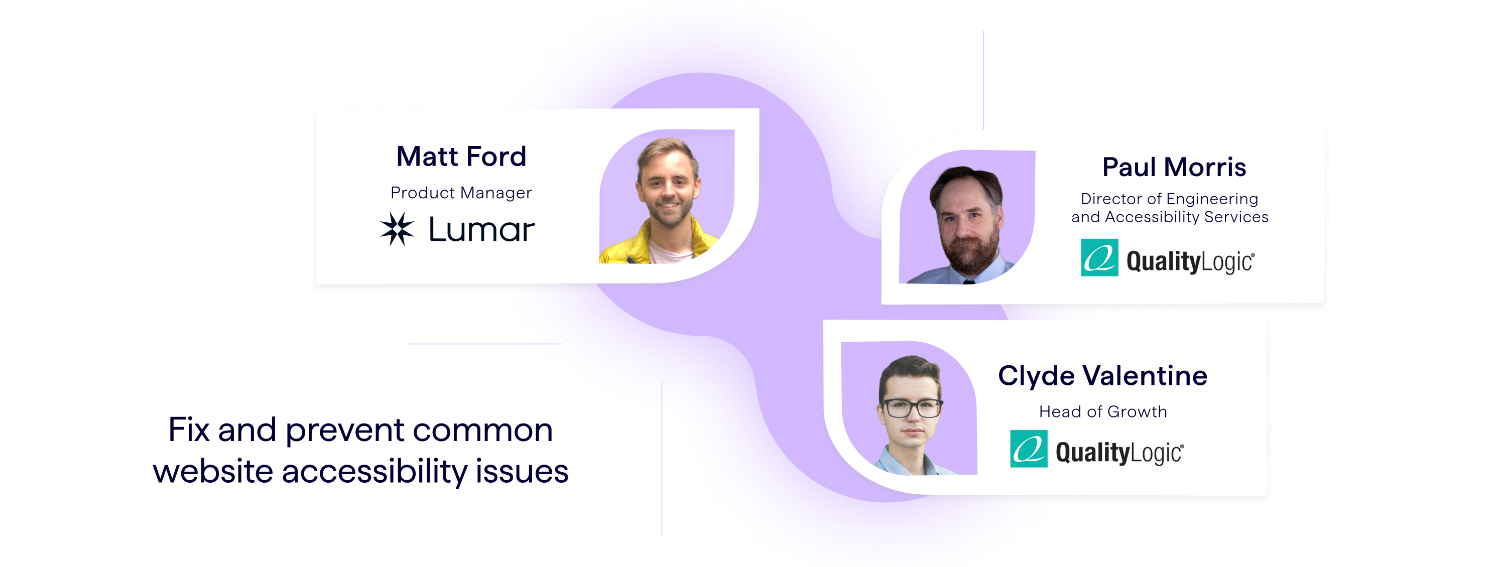
In this master class session, Lumar host and product manager Matt Ford is joined by digital accessibility experts Paul Morris, director of engineering and accessibility services, and Clyde Valentine, head of growth, both of a11y consulting firm QualityLogic.
In this webinar session, we cover:
- Common accessibility challenges that hold your business back from providing a better user experience, reaching wider audiences, meeting WCAG standards, and complying with regional accessibility laws.
- Practical tips to prioritize and fix accessibility issues on your website.
- Proactive approaches to prevent web accessibility issues from going live on your site and ensure ongoing compliance.
- Website accessibility tools and processes that help streamline the process.
- The impact of improving digital accessibility for your users.
- Q&A session with our guests to provide personalized feedback and answers to attendees’ pressing digital accessibility questions.
Read on for our key takeaways from the webinar, or watch the full video — with audience poll results and Q&A session — above.
First things first: what is meant by “website accessibility”?
Website accessibility is the inclusive practice of ensuring everyone can access and interact with digital content and information technology, said Clyde Valentine.
He notes that inclusivity in a digital accessibility context covers a wide range of users’ life situations and that users’ limitations may be permanent, temporary, or situational. Broadly speaking, the types of limitations that should be addressed under the scope of a digital accessibility program include:
- Visual impairments (for example, blindness or color blindness)
- Hearing impairments (for example, being hard of hearing)
- Learning, cognitive, and neurological impairments (for example, dyslexia or ADHD)
- Physical and motor-control impairments (for example, cerebral palsy)
- Aging-related impairments (for example, Alzheimer’s or Parkinson’s)
Many of these users may use assistive technologies to support their interactions with the digital world. Assistive technology includes screen readers, portable closed captioning systems, speech-generating devices, and more. To improve accessibility and user experience for the 1 billion+ people worldwide who experience some form of disability, websites and other interactive content should be compatible with these technologies.
“It takes intent to build with accessibility in mind. It doesn’t happen by accident.
Clyde Valentine, Head of Growth, QualityLogic
He notes that there are different perspectives on user limitations: a medical model and a social model. The medical perspective, Valentine explains, tends to view limitations or disabilities as something that needs to be ‘corrected’, while the social model of disability acknowledges that a limitation may only exist because of how society or an environment is shaped or designed. He gives the example of a wheelchair user, who may be seen as limited from a medical perspective, but from the social model, if this user has access to wheelchair ramps wherever they intend to go, the limitation is no longer an issue.
“If an individual who uses a wheelchair has access to a wheelchair ramp, are they limited? Well, [from the social model perspective] the answer is no because they still have their mobility, they can still get to where they need to go.”
“Apply that thinking to the building and maintaining of websites. A person is limited only by our ability to make our website and our digital properties accessible.”
Addressing common digital accessibility challenges
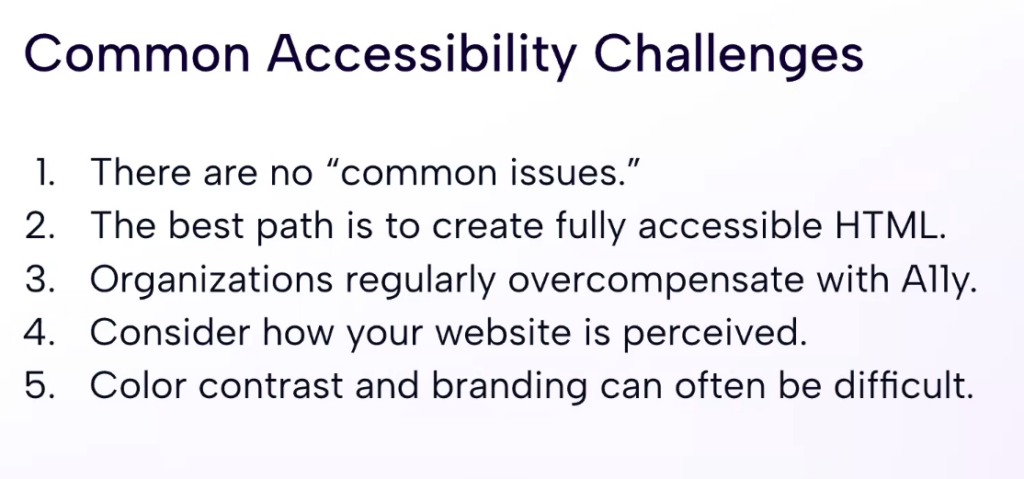
QualityLogic’s director of engineering and accessibility services, Paul Morris, is himself blind and is quick to note that in his experience there aren’t really common issues when it comes to website accessibility, but rather, common challenges.
When we think about web design, due to the flexibility of the frameworks, Morris explains, there are practically limitless ways of writing code. “What that does,” he says, “is provide a limitless opportunity to introduce accessibility issues.”
Aim for fully conformant HTML & don’t overcompensate with ARIA attributes
The assistive technology that is available to users today is often playing catch-up to emerging trends in web development. “Our goal when we’re designing for accessibility is to shoot for fully conformant HTML.”
Morris acknowledges that there are different HTML standards out there. “But if we are truly conformant and we’ve used HTML to the very core depths of what HTML should be, the assistive technology has the best opportunity to work with the website.”
Relying heavily on additional code like JavaScript, for example, means we’re adding even more layers on top of our core HTML that can potentially introduce more accessibility issues. “We have to give consideration to how much we’re trying to make a website act like an application,” Morris says. Introducing a lot of ‘cool new features’ to the website without carefully considering the accessibility angle may introduce new issues for users relying on assistive technologies to access the web.
“One of the ways we deal with this,” he says, “is a technology called ARIA: accessible, rich, Internet applications.”
What is ARIA?
ARIA (Accessible Rich Internet Applications) is a standard that was added to HTML to enable assistive technologies to interact better with website content.
“That said, there is a golden rule with ARIA,” Morris continues, “The first rule of ARIA is to not use ARIA. And I’ll give you a good reason why. As we’re doing development and introducing ARIA capability, there is a temptation to over source our application with just a ton of ARIA capabilities. That slows down assistive technology. So when we’re using this awesome capability, we have to use it with good judgment, so that we’re just not adding too much in — because too much of a good thing can be just as bad.”
A lot of the features in ARIA are things that HTML can do natively. Morris gives the examples of aria-label, aria-labelledby. “But there are HTML capabilities, like labels, like alt tags, like names — things which, automatically, will make it work correctly without having to use ARIA.”
Web developers who are keen to adopt a lot of ‘cool new features’ may be hindering accessibility efforts.
Addressing the “Perceivable” principle of accessibility
“Perceivable” is one of the four principles of website accessibility outlined in WCAG guidelines, the most well-known and widely adopted web accessibility guidelines. (The four principles of web accessibility can be remembered by the acronym POUR: Perceivable, Operable, Understandable, Robust.)
“Think about your website and strip out all styling and colors, all layout, and just make it into a linear progression that starts at top-left and goes to bottom-right,” Morris advises. “That’s how people perceive a website with assistive technology.”
“[With assistive technology used to access a website] there’s no concept of left and right. There’s no concept of anything other than the first element in a DOM through to the last element in the DOM.”
Morris explains that web developers and accessibility professionals can use things like landmark regions to provide some stylistic feedback to assistive technology, for example, by adding tags for navigation bars on a website.
“There’s a lot we can do to improve the perception of the individual interacting with something, even if, for example, they can’t see it” says Morris. “That’s something we really need to give consideration to.”
Color contrast accessibility issues
“I led by saying there are no common issues [in accessibility], but there is actually one area which you can consider somewhat common — the concept of color contrast,” Morris says.
While branding is important for businesses, users with color blindness or other vision issues, are not going to get that same benefit of branding if what it is doing is actually impairing the visual clarity or perceivability on your site.
“So what we have to consider is how to style a website with a sensible use of branding, but not having it where people are trying to interact with content,” suggests Morris.
If text layered on top of your brand’s color styling, for example, has an insufficient contrast ratio, people will struggle to read it. Similarly, layering text over busy graphics can also cause both color contrast issues and usability issues for users with visual impairments.
Create a practical website accessibility strategy
Matt Ford, product manager at Lumar, outlines five components of a practical, actionable strategy to address website accessibility at your organization:
- Align your organization around specific accessibility goals
- Set clear responsibilities and project owners
- Equip your team with the right tools and resources
- Think about timing
- Measure progress
Organizational alignment on web accessibility goals
“Have a shared goal. Have a shared target of where you are trying to get to,” Ford says. “Make that a clear policy within your company. So depending on where you’re aiming, and why — maybe it’s for complying with a specific regulation, maybe it’s a company-wide initiative to reach a certain standard for usability — define what that is.”
For example, your organization may want to aim for WCAG 2.1, level AA compliance. Align your team on what the specific targets are.
Who should be responsible for website accessibility?
There are likely many people in your organization who are involved with the website’s success, including developers, content managers, UX designers, and SEOs. All will have a role in maintaining a standard of accessibility. But having a named owner of overall web accessibility projects will help ensure the work gets done and success can be measured.
“Otherwise, things can get confused, things can drop off, and progress won’t be as clear or streamlined unless you’ve got that one person that’s the driving force reminding everyone of this initiative,” says Ford.
Web accessibility tools and resources
Your team needs to have the right resources to be successful in accessibility. This might be general digital accessibility training, the right website accessibility tools for testing and auditing, as well as expert support.
When to launch accessibility projects
So when is a good time to start working on accessibility?
According to Ford, the right time is really anytime. It is, of course, easier to include accessibility considerations before a site is launched than to retrofit things later on. But whether you’re developing a brand new site, migrating a website to a new domain or CMS, or simply aiming to improve an existing site, the sooner you can get started, the better. Be especially aware of accessibility issues that may crop up in conjunction with a rebrand, when new color contrast issues are particularly likely to appear.
Measuring progress
“There’s a lot of work that will come of starting to tackle your accessibility and it will take time. So it’s definitely worth tracking your progress over time, not only to understand what progress you are making but also to present that internally so the company can see,” says Ford.
Your digital accessibility project owners should be tracking digital accessibility metrics such as a reduction in the total number of accessibility issues identified on your site or meeting the specific WCAG compliance criteria your team had as its target.
The 3-stage process to identify and prevent website accessibility issues
1. Conduct a full site website accessibility audit
Start your accessibility audit by mapping out your different page templates and components to create a list of the website elements you need to test for accessibility.
Think about the specific types of pages and templates you have on your site, as well as any specific components used across your site. (For example, if you’re an e-commerce site, you may have: product pages, category pages, a shopping cart, check-out pages, etc. And you’ll likely have reusable components like your header navigation or carousels.)
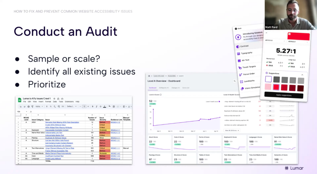
“Once you’ve got that list,” Ford says, “you can decide how you’re going to test them. This is where there’s a question of: do you go for a sampling approach or do you go for testing at scale?”
The sampling approach:
If you take a sampling approach to web accessibility audits, go through your list of page templates and components, pull out a few example URLs for each template, and test each of those sample URLs one at a time. The idea is to have a representative sample of the main templates on your site that you can check manually — there are several browser extensions and plugin tools you can use for a small-scale sampling approach, like the Stark plugin or Axe DevTools. Log the issues you find on the sample URLs in a spreadsheet to map out the potential accessibility issues that need to be addressed on your site.
The downside of a sampling approach, however, is that, in practice, you’re not really getting a comprehensive view of all the accessibility issues on your site, and will have to make a lot of assumptions based on a small sample size of pages. This means things can get missed quite easily, particularly if you’re working on a large website with hundreds of thousands – or millions – of pages.
“It’s very manual and it’s very time-consuming to do all of this one URL at a time — and it does leave room for missed issues,” says Ford of the sampling approach.
“For anyone that’s worked with websites, you’ll know it’s not always as clear-cut and nicely structured as you expect it to be — someone’s hacked the CMS somehow to add something to a specific page, or something’s been injected via JavaScript and it’s not part of the normal template — there are loads of ways that people hack their way around page templates and introduce issues that wouldn’t appear template-wide,” Ford explains. “There are all kinds of issues, like if you’ve inherited an old site that’s built on a load of different things and people have forgotten about a whole section of the site that they don’t know exists; there are all sorts of things that can come up that we’ve seen. So the other approach would be testing at scale.”
Accessibility testing at scale:
To avoid missing accessibility issues that can get missed in small-sample testing and reduce the need for manual page-by-page checks, consider using an automated web accessibility testing platform to audit your website at its full scale. “If you want to save a lot of time, reduce the risk [of the sampling approach], and build confidence that you have checked everything, you can use an automated testing platform to test your site at scale,” Ford says. “Something like Lumar allows you to essentially run a crawl [on your website] and apply accessibility tests to every single URL on your site.”
2. Set up website monitoring systems
Once you’ve conducted your audit and created a plan to fix the existing issues you’ve found on your website, the next step is to figure out how you’re going to keep on top of new issues that appear — it’s time to set up a monitoring system.
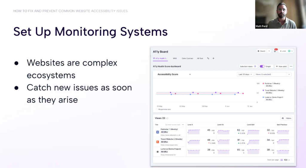
“It’s not a ‘one and done’ where you’ve done your [audit] and you can then forget about your accessibility issues. There will be new issues introduced. Given that websites are very complex ecosystems, there can be hundreds of different people touching them at any one time. You might have dozens of development teams working on just one site, including content creators and a bunch of different [roles],” says Ford.
Content teams that are updating your site on a daily basis may forget to add alt text to their images, or developers may need to develop a page that falls outside of your usual templates.
“You can’t possibly be aware of all the issues that are being introduced or even all the changes that are happening. So having a monitoring system when you have a regular check to identify any new issues is going to be important in catching them as they arise.”
3. Embed accessibility testing into the development process
“Finally, the next step in [accessibility] maturity is to prevent any issues from even making it onto the live site,” Ford explains.
Your website developers should already be conducting tests as they develop new features and pages for the site before they push any new changes to the live environment. Align with your dev teams to make sure they are checking for accessibility issues as part of their QA process.
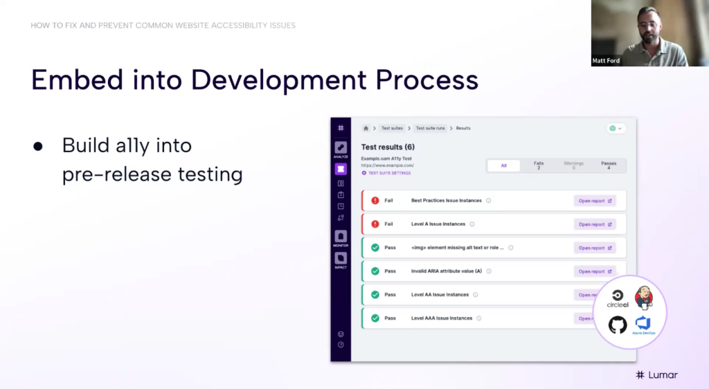
“Test in pre-production,” advises Ford. “If you identify any issues [in pre-production], it’s much cheaper and more efficient to fix it at this stage — before you push it to the live website — than it would be to push the issue live and then have to identify it, raise a bug ticket, prioritize that bug ticket against other work, and so on.”
The impact of website accessibility
For QualityLogic’s Paul Morris, the impact our digital accessibility efforts have depends in part on businesses being able to move away from thinking about accessibility as solely a compliance problem and instead start thinking inclusively about their users and customers.
“Compliance is not the same as a good experience,” Morris says. “It’s actually quite possible to create a fully compliant experience where people with assistive technology are still going to struggle.”
He adds: “It’s really really important that you give people that use assistive tech a path to talk to someone about the problems they’re having.”
Morris recommends including an accessibility statement on your web property or mobile app that includes a path where users can report issues to your team. And there needs to be someone on the other end ready to reply.
As a blind user, Morris has lived experience of dealing with websites that undoubtedly tick the compliance box but are not yet providing him with a satisfying user experience. In fact, he notes that he has reached out about access issues to four websites in the past couple of weeks. But only one team has responded.
“Which one of those four do you think I’m going to be most inclined to talk to — and use their services — going forward?”
There is the obvious business opportunity around creating better user experiences that serve more customers. But there is also an opportunity for organizations to stand out above the crowd by setting themselves apart from those who are lagging in their accessibility provisions.
“It’s pragmatic, right? This is where the business case [for web accessibility] comes in,” says Morris. “There are people that have alternative modalities in their life. They want to interact with your product. I submit that it’s not a good thing for a business to exclude people just on the grounds that they may have something going on in their lives that prevents them from being able to interact in what many people might call the ‘normal’ way. I do want to have us think outside the box, as a group; understand that all of us have our own life situations and if we can try to project our own empathy a little bit into this situation, that’s where we’re going to be able to create a better experience for everyone.”
Further reading:
- The Business Case for Website Accessibility
- Why SEOs Need to Understand Accessibility
- Webinar: Getting Started With Digital Accessibility
Connect with the webinar speakers
- Clyde Valentine, Head of Growth, QualityLogic
- Paul Morris, Director of Engineering and Accessibility Testing Services, QualityLogic
- Matt Ford, Product Manager at Lumar 👋
